Vincent Gable’s Blog

April 21, 2009

A Scalpel Not a Swiss Army Knife

Filed under: Design,iPhone,Programming,Quotes,Usability | ,
― Vincent Gable on April 21, 2009

Steven Frank summarizing feedback on the direction future of computer interfaces,

The other common theme was a desire to see applications become less general purpose and more specific. A good example was finding out train or bus schedules. One way to do this is to start up your all-purpose web browser, and visit a transit web site that offers a downloadable PDF of the bus schedule pamphlet. Another way is to use an iPhone application that has been built-to-task to interface with a particular city’s transit system. It’s no contest which is the better experience.

…In 2009, it’s still a chore to find out from the internet what time the grocery store down the street closes — we’ve got some work to do.

I would like to see a nice pithy term replace “very specific task-driven apps”. Perhaps “Specialty Applications” or “Focused Programs”. But I’m not enamored with ether. Whatever the term, it should emphasize excelling at something, not being limited. What are your thoughts for a name?

April 15, 2009

Beyond Two Page Programs

And one of the things that is disturbingly true about most novices on computers is that about 2 pages of program is the maximum they can handle. They like to spread it out, use their visual field as an extension of their short term memory

–Alan Kay From Doing With Images Makes Symbols

A few thoughts on this phenomenon.

A denser, more concise, less “English like” programming language would counter-intuitivly be easier for novices to use, if it let them keep their project below the 2-page limit.

Does this limit increase with more and bigger displays?

Do graphical programming language change anything? It seems like they might “scale” better on a very large display. But in my (albeit limited) experience they are much less compact then textual source code. And it’s not clear to me they support abstraction as well.

April 6, 2009

A Teddy Bear in the Uncanny Valley

Filed under: Design | , , ,
― Vincent Gable on April 6, 2009

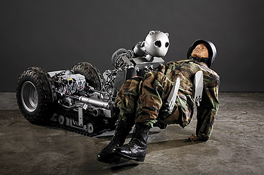
I came across this creepy robot on Sentient Developments,

battlebot.jpg

… Its head is designed to look like that of a teddy bear, to provide reassurance to the wounded soldier it is transporting.

I don’t think I’m alone in finding that cold metal visage discomforting. I wouldn’t want to come-to, bleeding on a battlefield, staring into those lifeless inhuman eyes.

Personally I think a red cross symbol on a plywood board would make a better head. It’s not unsettling, and it’s what medics wear, so it means “help” to the wounded.

What I find so interesting about the BEAR’s “face” is that it’s clearly nonhuman, yet feels off in the same way as an android from the Uncanny Valley. My understanding of the Uncanny Valley phenomenon was that people didn’t reject creations that didn’t mimic some real creature. But I can’t accept the BEAR, even though it’s mimics a fuzzy-doll, not any kind of living creature.

I think the BEAR is an important advance in life-saving technology. I’m sure that robots will have an important roll in dangerous rescues, on and off the battlefield. But I have a feeling that a more purly-mechanical looking machine would have a more pleasing bedside manner.

April 1, 2009

Microsoft Excel Does Not Excel at Graphing

Filed under: Design,Quotes,Usability | , , , ,
― Vincent Gable on April 1, 2009

I gripe about Excel a lot, as we’re more or less forced to use it for data analysis in the intro labs (students who have taken the intro engineering course supposedly are taught how to work with Excel, and it’s kind of difficult to buy a computer without it these days, so it eliminates the “I couldn’t do anything with the data” excuse for not doing lab reports). This is a constant source of irritation, as the default settings are carefully chosen so as to make it difficult for students to do a good job of data presentation.

Now, you might be saying “Well, of course Excel isn’t appropriate for scientific data analysis. It’s not really for scientists, though.” Which is true, but here’s the thing: the things I’ve complained about here aren’t good for anything. The color schemes and axis settings lead to illegible plots no matter what sort of data you’re working with. And I’m completely at a loss as to the purpose of the “Line” plot, or making it difficult to find uncertainties in fitted quantitites.

Professor Chad Orzel, Why Does Excel Suck So Much?

There’s no question in my mind that a lot of serious analysis is done in(spite) Excel. I’ve worked with some very smart programmers, with PhDs in experimental science, who have “numerics” in their job description, and used Excel to make quick graphs.

The best solution I can recommend is reading The Visual Display of Quantitative Information. It’s probably the best guide to honestly presenting data graphically.

Unfortunately I don’t have a good recommendation for a better software program. The excellent redrawings at the chartjunk blog were done in Adobe Illustrator (more info in this comment). But Illustrator costs $599, and is a complex drawing program. Honestly the sticker price, and ease of use, have kept me from trying it.

What do you use to draw graphs?

March 13, 2009

Reasons to WANT to Design For Accessibility

Accessibility is too often seen as a chore. But there are many reasons to be excited about making things usable for everyone.

It Just Feels Good

I know it’s cliché, but helping people does feel good. Making your website work with screen-readers is not the same as volunteering your time to read for the blind and dyslexic. But it still helps…

More cynically, accessibility means your work reaches more people. Even if it’s just an extra 0.6%, it still feels good to know you are having a bigger impact.

We Are All Impaired

As Keith Lang points out, “we are all impaired to some amount (or sometimes)”. Everyone is “deaf” in a library, because they can’t use speakers there. Similarly, if you try showing a video on your phone to a dozen people, many of them will be “blind”, because they can’t see the tiny screen.

Consequently, accessibility means designing for everyone, not just a disabled super-minority.

Accessible Design is Better Design

Usability improves when accessibility is improved. For example, a bus announcing stops with speakers and signs means you can keep listening to your iPod, or looking at your book, and still catch your stop. It makes buses easier to ride.

Maximally accessible design engages multiple senses. Done well that means a more powerful experience.

Early Warning

The flip-side of accessibility improving usability is that bad design is hard to make accessible. How easy it is to make something comply with accessibility guidelines is a test of the soundness of the design.

I don’t care about accessibility. Because when Web design is practiced as a craft, and not a consolation, accessibility comes for free.

Jeffrey Veen

Accessibility compliance should be like running a spellcheck — something quick and easy that catches mistakes. When it’s not, it’s a warning that something is fundamentally wrong. That’s never fun, but the sooner a mistake is caught, the cheaper it is to correct it.

Challenge the Establishment

Accessibility might be the best “excuse” you’ll ever get to do fundamental UX research.

I think for people who are interested in user interface disability research is another area that gets you out of the Mcluhan fishbowl(??) and into a context where you have to go back to first principles and re-examine things. So I think the future there is very bright but we need more people working on it.

–Alan Kay, Doing With Images Makes Symbols

If anybody knows what he meant by what I heard as “Mcluhan fishbowl” please let me know!

Technology is Cool

Accessible design makes content easier for machines and programmers to deal with. This makes the future possible. For example, embedding a transcript in a video means that the video’s contents can be indexed by google, or automatically translated, etc.

BUt the really exciting stuff hasn’t happened yet.

Accessibility research is going to be a huge part of what advances the state of the art in Augmented Reality and cybernetics/transhumanism. The common theme is mapping data from one sense to another, or into a form that computers (eg. screen readers today) can process.

Why do You Like it?

I’d love to know what makes you passionate about accessibility. For me it’s that it feels right, and as a programmer, I am very excited about what it enables.
A Chair for Design

Filed under: Design,Quotes | , ,
― Vincent Gable on March 13, 2009

Alan Kay explained why he liked beanbag chairs at PARC,

And one of the reasons we used them was that we discovered it was almost impossible to leap to your feat to denounce someone once you had sat in a bean bag chair, because you tended to sink into it further and further. So it had a way of relaxing people and it was very good for design.

From Doing With Images Makes Symbols

What seating arrangement do you think works best for creativity, both individual and group? Personally I like pacing when I’m thinking alone.

March 10, 2009

Dashboards on Steering Wheels Are Complicated

Filed under: Design,Quotes,Usability | ,
― Vincent Gable on March 10, 2009

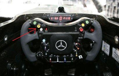
Given that all 11 F1 teams have converged on a remarkably similar UI (for a dashboard on a steering wheel), independently, you would think that (the style) was a rational design, however its complexity possibly caused Lewis Hamilton the 2007 F1 championship, when he accidentally pressed the neutral button …

825b387026c6c81ef5a96970ccd12ee8-orig.png

What is clear is that there is no clear accentuation of features (color, size) by how often the are used, merely by position. Even if drivers like Hamilton are experts and fully familiar with the UI, there is a tiny percentage chance of error. Our guess is that this trend in car UI would be a mistake if it filters through to everyday cars, and that F1 cars will revert to a more simple UI over time.

oobject.com (article includes a gallery of F1 steering wheels)

Certainly I have made mistakes with traditionally mounted dashboards in every car I have owned. But the mistakes haven’t significantly impaired by driving. Accidentally turning on the air conditioner or radio aren’t a big deal — even with my old Volvo that couldn’t accelerate as well with the AC on.

February 23, 2009

Laptop Mats

Filed under: Announcement,Design,Usability | , ,
― Vincent Gable on February 23, 2009

I just really want somebody to make a good portable cooling pad for portable computers.

Laptops1 are too hot to be used on a lap. This Penny Arcade comic says it best, if a little crudely,

Using this Macbook is like putting my dick in a George Foreman Grill. Okay? It’s like making a penis panini.

There’s a real need for something to keep your your lap cool. You can buy gel cooling pads. But I have reservations about them. The biggest is the weight of the gel. And according to reviews, eventually the pad absorbs enough heat to turn into a hot pad.

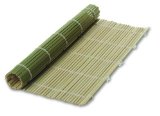
My solution is inspired by sushi mats:

415ANWJ8X6L._SL160_.jpg

It’s a very simple idea really, instead of bamboo slats, you use hollow aluminum tubes in the mat. That gives you an extremely light pad that’s easy to roll up and carry anywhere. It keeps the hot computer off your lap, draws heat away from the computer. (Aluminum has been used to make heat sinks for decades.)

Oh, and just in case you were wondering I’m using a book to protect my lap as I write this. But books are heavy, so I only carry one if I need to refer to the book.

If you have a better way to stay cool while working on the road, please share!


1
I’m counting netbooks (inexpensive, ultraportable but slow computers) as separate from “laptops”. Certainly many netbooks work just fine on top of the lap. But some people will always need more powerful laptops.

February 19, 2009

Security vs? Usability

Filed under: Design,Programming,Quotes,Security,Usability |
― Vincent Gable on February 19, 2009

In most cases, how an authentication system works when a legitimate user tries to log on is much more important than how it works when an impostor tries to log on. No security system is perfect, and there is some level of fraud associated with any (authentication method). But the instances of fraud are rare compared to the number of times someone tries to log on legitimately.

Bruce Schneier on balancing security and usability

I like thinking about security. But, inspite of all the dramatic headlines, I believe bad usability causes far more damage then the bad security.

A more usable system should make recovering from a security breech easier. It’s easier to make things right, when it’s easier to make things.

Usability limits what people can do with something. Is it just coincidence, or does that sound like a partial definition of security?

Sustainable Design

Filed under: Announcement,Design | , ,
― Vincent Gable on February 19, 2009

Good design is endearing. When people like something, they keep it, and don’t replace it. Well designed products tend to stick around — for generations.

In this way, good design encourages reuse; discourages disposability.

It may be much more costly, monetarily and environmentally, to build something outstanding. An exceptional design can mean exceptionally difficult manufacturing. But savings mount up over time, as the artifact endures, and eliminates many disposable products.

I still shave with straight razors that are 60-80 years old. Although manufacturing, say a new Thiers-Issard razor, is expensive, the legions of disposable shavers it nullifies will grow for decades, possibly centuries.

Good design really is good for the planet.

« Newer PostsOlder Posts »

Powered by WordPress