Consider a technique used by the legendary pickpocket Apollo Robbins…. When the researchers asked him about his devious methods—how he could steal the wallet of a man who knew he was going to have his pocket picked—they learned something surprising: Robbins said the trick worked only when he moved his free hand in an arc instead of a straight line. According to the thief, these arcs distract the eyes of his victims for a matter of milliseconds, just enough time for his other hand to pilfer their belongings.
At first, the scientists couldn’t explain this phenomenon. Why would arcs keep us from looking at the right place? But then they began to think about saccades, movements of the eye that can precede conscious decisions about where to turn one’s gaze. Saccades are among the fastest movements produced by the human body, which is why a pickpocket has to trick them: The eyes are in fact quicker than the hands. “This is an idea scientists had never contemplated before,” Macknik says. “It turns out, though, that the pickpocket was onto something.” When we see a hand moving in a straight line, we automatically look toward the end point—this is called the pursuit system. A hand moving in a semicircle, however, seems to short-circuit our saccades. The arc doesn’t tell our eyes where the hand is going, so we fixate on the hand itself—and fail to notice the other hand reaching into our pocket. “The pickpocket has found a weakness in the way we perceive motion,” Macknik says. “Show the eyes an arc and they move differently.”
May 3, 2009
Confounding Circles
March 13, 2009
A Chair for Design
Alan Kay explained why he liked beanbag chairs at PARC,
And one of the reasons we used them was that we discovered it was almost impossible to leap to your feat to denounce someone once you had sat in a bean bag chair, because you tended to sink into it further and further. So it had a way of relaxing people and it was very good for design.
From Doing With Images Makes Symbols
What seating arrangement do you think works best for creativity, both individual and group? Personally I like pacing when I’m thinking alone.
February 11, 2009
Black on White, White on Black
Command-Option-Control-8 will invert your screen. It’s a cool looking effect (and quite a prank if you do it to someone else’s machine), but most importantly it makes tiny-white-text-on-black webpages easier to read. Command Plus/Minus makes text larger/smaller, which helps too.
I’ve known for some time that dark text on a white background is most readable. But it until recently it was just “book learnin”. I’m young, my eyes are healthy, and I can read both color schemes just fine. I didn’t have proof I could see.
But I have trouble sleeping sometimes. A few days ago I had an “accident” with a 2L bottle of Mountain Dew and a late-night dinner of salty pizza. Look, the details of blame aren’t important here, the point is I didn’t get to sleep that night. Now, when you are very tired, it’s harder to focus your eyes — and having to focus them on a computer screen doesn’t help. About 3 in the afternoon it got downright painful to read trendy looking webpages with midnight backgrounds and petite white text. Remembering the color theory behind contrast, I gave Command-Option-Control-8 a shot, and holy shit, it worked! My screen looked like an adventure in black-lighting gone horribly wrong. But I could focus on those webpage’s text more clearly. Degraded vision from eye-fatigue gave me proof that I could see.
Now please don’t take this as anything but a biased anecdote. Trust the science, not me! But it was a neat (and painful) experience. I can see why Command-Option-Control-8 is there now. Give it a try sometime, and see if it helps for you. The most you have to lose is impressing any shoulder surfers with your computer wizardry. (Honestly though Command-Plus — make text bigger — will probably do more to enhance readability.)
Just in case you want to inver the screen programatically, this Apple Script will do the job:
tell application "System Events" to tell application processes to key code 28 using {command down, option down, control down}
February 5, 2009
Pens Suck
In 1987, Alan kay said,
By the way, Sketchpad was the first system where it was discovered that the light pen was a very bad input device. The blood runs out of your hand in about 20 seconds, and leaves it numb. And in spite of that it’s been re-invented at least 90 times in the last 25 years.
Almost 50 years after Sketchpad, you can find a light pen at any computer store today. Today, these light pens are used to supplement more circulation-friendly input devices. Maybe that’s enough to solve the problems Sketchpad had.
Personally, I think the metaphor of a the pen is too blindingly strong. People love their pens, because they grew up with them. I don’t accept that they are the pinnacle of input. We can do better then copying a pointy stick filled with dye.
But I have my own biases and unique experiences. I am dysgraphic — I have trouble writing legibly by hand, and spelling. To me a pen is not something that feels good or puts me in the zone. It’s something that gets in the way of expressing my ideas. But fundamentally, isn’t every input device a barrier between your mind and the medium?
January 17, 2009
Lessons From Fast Food: Efficiency Matters
Every six seconds of improvement in speed of service amounts to typically a 1% increase in sales. And it has a dramatic impact on the bottom line.
–John Ludutsky, President of Phase Research, quoted on the “Fast Food Tech” episode of Modern Marvels, aired 2007-12-29 on the History Channel.
I wouldn’t expect things to be much different in the software world. The faster you get your burger bits the better.
UPDATED: 2009-02-05:
Apparently people want service much faster from software. Greg Linden reports,
Half a second delay caused a 20% drop in traffic. Half a second delay killed user satisfaction.
This conclusion may be surprising — people notice a half second delay? — but we had a similar experience at Amazon.com. In A/B tests, we tried delaying the page in increments of 100 milliseconds and found that even very small delays would result in substantial and costly drops in revenue.
If the Mr Ludutsky’s figure is accurate, a 20% drop in fast-food revenue would require a two minute delay. Does this mean every second spent waiting on a computer is as bad as waiting 4 minutes in meatspace? I don’t know — I’m doing a lot of extrapolation from hearsay. But it’s something to consider.
December 31, 2008
Ellison’s Law
Carl Ellison (a cryptographer at Intel, a great guy) formulated what I call Ellison’s Law, which states that the userbase for strong cryptography declines by half with every additional keystroke or mouseclick required to make it work. Think about that when you’re designing tools.
Mac OS X Redesign: Feedback for “Hold Keys”
To prevent particularly bad slips (physical, not cognitive, mistakes), Apple makes certain keys hold keys. That means you have to hold them down for a while before they do their thing, unlike any other button that you just tap to use. This prevents accidentally engaging the hold keys, because a quick tap isn’t enough to trigger them. Unfortunately, it causes major problems for users. Apple could fix things by simply adding 3 words to the key-pressed-indicators they already use, and displaying it immediately.
The eject key is a hold key on MacOSX 10.4.9+. It’s a pretty bad thing to accidentally activate, because it takes several seconds to put a physical disk back into a tiny slot . By comparison the most common slips (typos), can be corrected in a split-second with 2 keystrokes(delete + the right letter). The eject key is located just above the delete key (which behaves like backspace on other computers), and right next to F12, which by default is mapped to Dashboard. Both of these keys are relatively high traffic, so it’s a sure bet that many a slipped finger will tap the eject-key. Making the eject-key a hold key prevents accidental taps, because a tap isn’t enough to trigger it.
caps lock on new keyboards is a hold key to turn on (but not off). Anything that makes caps lock harder to engage is great, since there’s no good reason to have a caps lock key anyway.
But there is a big problem with what Apple has done here. There isn’t any indication that hold keys are special. Worse, if you try to use one the way you use every other button on the keyboard, mouse, or computer — by tapping them – nothing happens. It’s like the hold keys are broken. here’s a video showing how confusing the eject key is.
One of the first things I noticed after updating Mac OS X Tiger to 10.4.9 was that my CD eject key didn’t seem to work anymore
Unfortunatly, that is a common reaction.
All hold keys should give immediate feedback when tapped, and also indicate that they need to be held down to trigger their action. Macs already flash an translucent eject indicator when the eject key’s action is performed:

Immediately displaying the following indicator, and pulsing the symbol when the action is triggered does everything we need:
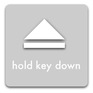
This is just a quick mock-up to get the idea across, it has a lot of flaws.
Unlike the eject symbol, the text has no drop shadow — this makes it less busy, and easier to read; but arguably unaesthetic.
The text is in all lowercase, because all words on Apple keyboards are in all lowercase. The idea is that it more closely associates the instructions with the keyboard. It’s probably a mistake, since it does not follow the capitalization rules for Mac OS X, but it made sense to me at the time.
The text also should have a stronger border, so it will show up clearly no matter what it is displayed over. And it should be bigger. And in a better font.
But hopefully this is enough to get my idea across.
December 30, 2008
Different Symptoms of Different Eyestrain
(Sheedy, Hayes, & Engle) found that reading with difficult environmental conditions such as upward gaze, glare, flickering light, or small text caused the participants to report symptoms of burning, irritation, and dryness.
While reading with internal problems like having to turn your eyes inward, astigmatism, and stress on the focusing lens caused the participants to report ache, strain, and headache.
Sheedy, J.E., Hayes, J., & Engle, J. (2003). Is all Asthenopia the Same? Optometry and Vision Science, 80 (11), 732-739.
Via fontblog.
December 26, 2008
Which Side To Use
If you are ambidextrous, feel smug and ignore this.
Keep your keys, wallet, or whatever opens doors, in your weak-side pocket.
This is a bit counterintuitive. I used to keep them in my strong-side pocket for years. It’s natural to use your strong hand to unlock a door or buy a sandwich. But it causes problems when you need to open a door while carrying something awkward/heavy (say groceries, a cat, etc).
You should be carrying awkward things with your strong hand. It’s safer and easier. But when your strong-hand is full, it’s hard to get keys from your strong-side pocket. Meanwhile, keys in your weak-side pocket are still easy to employ.
I’m not especially dexterous, but in my experience, using my weak hand to unlock something hasn’t been a problem. I expected it to be harder, but honestly it hasn’t been perceptibly more difficult. Keeping keys in my weak-side pocket has been nothing but good.
Mobile-phones, pocketknives, cameras, PDAs, etc. should be in your strong-side pocket.
You should be using your strong-hand when you use them, but more importantly you (generally) don’t need to use them while carrying something. Cutting stuff while carrying a bag of groceries is a bad idea, for example.But, anything you need to use while your strong hand is full should still live on your weak side with your keys. Phones make handy flashlights, for example.
Hold drinks with your weak hand.
I’ve been trying to train myself to do this for years, and I haven’t been able to.
The theory is that your weak hand is plenty up to the task of bringing a glass to your mouth (if it isn’t, you shouldn’t be drinking!), and it’s useful to have your strong hand free. Plus holding a cold drink makes your hand cold and wet, which surprisingly isn’t cool when you need to shake with that hand. So holding drinks in your left hand = a better first impression.
May 27, 2008
Readable Colors
…the most readable color combination is black text on white background; overall, there is a stronger preference for any combination containing black. The two least readable combinations were red on green and fuchsia on blue.
…
Also, in every color combination surveyed, the darker text on a lighter background was rated more readable than its inverse (e.g. blue text on white background ranked higher then white text on blue background).
I wish Columbia Blue and Red were tested in the survey. They were my high school’s colors; and they were terrible. The worst permutation was blue text on a red background.
Question for all you who prefer light source-code on a dark background: why do you like it?