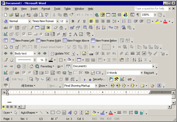
…But in practice, nearly all the great analytical designs have come from those possessed by the content; people who have learned something important and want to tell the world about what they have learned. That is, content-driven and thinking-driven, and not at all driven by bureaucratic externalities of marketing, human factors, commercial art, focus groups, or ISO standards.
In working on 4 books on analytical design, I have often turned to the human factors literature, and then left in despair, finding few examples or ideas (beyond common-sensical) that were useful in my own work. This contrasts to the work of scientists, artists, art historians, and architects–work overflowing with ideas about evidence, seeing, and the craft of making analytical displays.
I believe that work about analytical displays should be self-exemplifying; that is, the work should show us amazing displays of evidence. My despair about human factors began many years ago upon going through volumes and volumes of the journal, Human Factors, where evidence was reported using statistical graphics of wretched quality, with thinner data and worse designs than even in corporate annual reports.
Also the methodological quality of the research was poor, and so nothing was credible. The findings seemed entirely context-dependent, univariate (design and seeing are profoundly multivariate), and without scope: what did it matter if some students in freshman psychology in Iowa preferred one clunky font compared to another clunky font in an experiment conducted by a teaching assistant? Later, while consulting, I saw this naive dust-bowl empiricism fail again and again for nearly a decade in trying design a competent PC OS interface. (And with the Mac interface sitting there, smiling, all the time. Apple’s superb interface guidelines seemed to me to be a retrospective account of the beautiful hands-on craft of a few brilliant designers, not a reason to have experimental psychologists attempt to design OS/2 and Windows.)
At any rate, if this was the scientific practice and the design craft of applied psychology, I concluded the field did not have much to contribute to my own work on analytical design.
I happily fled to the classics of science, art, and architecture.
— Edward Tufte, November 27, 2002 (emphasis mine).
It’s still pretty bleak.
