Fundamentally, a computer is a tool. People don’t use computers to use the computer, they use a computer to get something done. An interface helps people control the computer, but it also gets in their way. Inevitably, any on-screen widget is displacing some part of the thing the user is trying to manipulate.
As an infamous example, expanding Microsoft Word’s toolbars leaves no room for actually writing something,
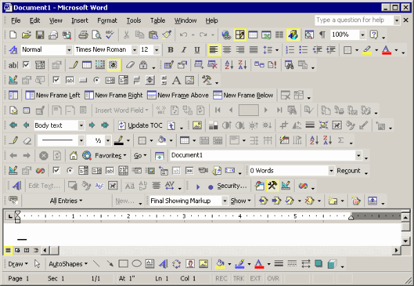
(Screenshot by Jeff Atwood)
Users don’t want to admire the scrollbars. Truth be told, they don’t even want scrollbars as such, they just want to access content and have the interface get out of the way.
Show The Data
I highly recommend Edward Tufte’s The Visual Display of Quantitative Information. It’s probably the most effective book or cultivating a distaste for graphical excesses.
Tufte’s teachings are rooted in static print. But many of the principles are just as valuable in interactive media. (And static graphics are still very useful in analysis and presentation. Learning how to graph better isn’t a waste of time.)
Tufte’s first rule of statistical graphic design is, “Show the data” , and it’s an excellent starting point for interface design as well.
Cathy Shive has an excellent post expanding on Tufte’s term Computer Administrative Debris.
The Chartjunk blog showcases a few real-world examples of Tuftian redrawings.
Get Out of My Mind
Learning happens when attention is focused. … If you don’t have a good theory of learning, then you can still get it to happen by helping the person focus. One of the ways you can help a person focus is by removing interference.
–Alan Kay, Doing With Images Makes Symbols.
Paradoxically then, the better the design, the less it will be noticed. We should strive to write our interfaces in invisible ink.