To prevent particularly bad slips (physical, not cognitive, mistakes), Apple makes certain keys hold keys. That means you have to hold them down for a while before they do their thing, unlike any other button that you just tap to use. This prevents accidentally engaging the hold keys, because a quick tap isn’t enough to trigger them. Unfortunately, it causes major problems for users. Apple could fix things by simply adding 3 words to the key-pressed-indicators they already use, and displaying it immediately.
The eject key is a hold key on MacOSX 10.4.9+. It’s a pretty bad thing to accidentally activate, because it takes several seconds to put a physical disk back into a tiny slot . By comparison the most common slips (typos), can be corrected in a split-second with 2 keystrokes(delete + the right letter). The eject key is located just above the delete key (which behaves like backspace on other computers), and right next to F12, which by default is mapped to Dashboard. Both of these keys are relatively high traffic, so it’s a sure bet that many a slipped finger will tap the eject-key. Making the eject-key a hold key prevents accidental taps, because a tap isn’t enough to trigger it.
caps lock on new keyboards is a hold key to turn on (but not off). Anything that makes caps lock harder to engage is great, since there’s no good reason to have a caps lock key anyway.
But there is a big problem with what Apple has done here. There isn’t any indication that hold keys are special. Worse, if you try to use one the way you use every other button on the keyboard, mouse, or computer — by tapping them – nothing happens. It’s like the hold keys are broken. here’s a video showing how confusing the eject key is.
One of the first things I noticed after updating Mac OS X Tiger to 10.4.9 was that my CD eject key didn’t seem to work anymore
Unfortunatly, that is a common reaction.
All hold keys should give immediate feedback when tapped, and also indicate that they need to be held down to trigger their action. Macs already flash an translucent eject indicator when the eject key’s action is performed:

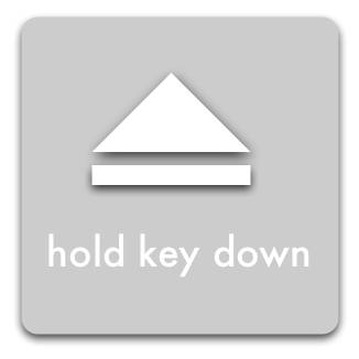
Immediately displaying the following indicator, and pulsing the symbol when the action is triggered does everything we need:

This is just a quick mock-up to get the idea across, it has a lot of flaws.
Unlike the eject symbol, the text has no drop shadow — this makes it less busy, and easier to read; but arguably unaesthetic.
The text is in all lowercase, because all words on Apple keyboards are in all lowercase. The idea is that it more closely associates the instructions with the keyboard. It’s probably a mistake, since it does not follow the capitalization rules for Mac OS X, but it made sense to me at the time.
The text also should have a stronger border, so it will show up clearly no matter what it is displayed over. And it should be bigger. And in a better font.
But hopefully this is enough to get my idea across.