Vincent Gable’s Blog

March 25, 2009

“They’re Not Getting It”

Filed under: Usability | , ,
― Vincent Gable on March 25, 2009

Writing is communication. I’ve always considered the clearest writing the best writing, because it communicates better. That’s why I believe you shouldn’t have to “get” good writing; good writing explains itself.

There has been some criticism of the classic The Elements of Style, because it didn’t follow it’s own advice. Critics call it a mistake, but many people think it’s an intentional joke. Assuming it’s a joke, I think it’s still a black-mark, because educated people aren’t getting it. Jokes that get in the way of what you are trying to say aren’t funny enough to justify themselves. In general, if people don’t get what you are saying, it’s your fault for not explaining it well.

Here’s an offending passage, as you can see it breaks it’s own advice.

The subject of a sentence and the principal verb should not, as a rule, be separated by a phrase or clause that can be transferred to the beginning.

How droll.

Now, The Elements of Style is a classic that’s been informing writers for generations. That success can’t be argued against. If confusing meta-humor is the reason for it, then I can’t contest that.

But it’s not clear to me that the specifically confusing and self contradictory humor has been key. For example, John Gruber says he loves the book because it takes it’s own advice,

I think what makes it special is that it’s so self-exemplifying; it recommends vigorous straightforward prose using vigorous straightforward prose.

If people aren’t getting your jokes, the onus is on you — in exactly the same way it’s your responsibility to make sure your jokes are funny.

February 10, 2009

Good engineering is necessary, but good design has a more direct impact on helping people do amazing things with computers

Filed under: Design,Programming,Quotes,Usability | , ,
― Vincent Gable on February 10, 2009

…the thinking that ultimately sunk Douglas Engelbart’s visionary but incredibly complicated OLS (online system): Engelbart didn’t consider it all that necessary to develop an easy-to-use interface because, he felt, people invested years in learning human languages, so why not invest 6 months in learning his system’s powerful, language-size command structure? It’s an interesting argument when you think about it that way, but it ultimately doomed his design to obscurity, while his proteges who left for Xerox PARC and designed a system people could learn to use in a hour went on to change the world. Frictionless user experience is paramount, engineering concerns are secondary.

Buzz Andersen, summarizing John Markoff’s What the Dormouse Said, a history of the early personal computer industry

The title this post is something I’ve been saying as part of my personal statement on hirevincent.com for years.

December 31, 2008

Mac OS X Redesign: Feedback for “Hold Keys”

Filed under: Design,MacOSX,Usability | , , , ,
― Vincent Gable on December 31, 2008

To prevent particularly bad slips (physical, not cognitive, mistakes), Apple makes certain keys hold keys. That means you have to hold them down for a while before they do their thing, unlike any other button that you just tap to use. This prevents accidentally engaging the hold keys, because a quick tap isn’t enough to trigger them. Unfortunately, it causes major problems for users. Apple could fix things by simply adding 3 words to the key-pressed-indicators they already use, and displaying it immediately.

The eject key is a hold key on MacOSX 10.4.9+. It’s a pretty bad thing to accidentally activate, because it takes several seconds to put a physical disk back into a tiny slot . By comparison the most common slips (typos), can be corrected in a split-second with 2 keystrokes(delete + the right letter). The eject key is located just above the delete key (which behaves like backspace on other computers), and right next to F12, which by default is mapped to Dashboard. Both of these keys are relatively high traffic, so it’s a sure bet that many a slipped finger will tap the eject-key. Making the eject-key a hold key prevents accidental taps, because a tap isn’t enough to trigger it.

caps lock on new keyboards is a hold key to turn on (but not off). Anything that makes caps lock harder to engage is great, since there’s no good reason to have a caps lock key anyway.

But there is a big problem with what Apple has done here. There isn’t any indication that hold keys are special. Worse, if you try to use one the way you use every other button on the keyboard, mouse, or computer — by tapping them – nothing happens. It’s like the hold keys are broken. here’s a video showing how confusing the eject key is.

One of the first things I noticed after updating Mac OS X Tiger to 10.4.9 was that my CD eject key didn’t seem to work anymore

Unfortunatly, that is a common reaction.

All hold keys should give immediate feedback when tapped, and also indicate that they need to be held down to trigger their action. Macs already flash an translucent eject indicator when the eject key’s action is performed:

Media Eject Symbol

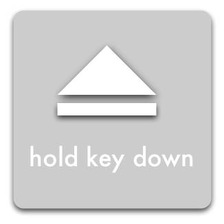
Immediately displaying the following indicator, and pulsing the symbol when the action is triggered does everything we need:

Media Eject Symbol + 'hold key down' message

This is just a quick mock-up to get the idea across, it has a lot of flaws.

Unlike the eject symbol, the text has no drop shadow — this makes it less busy, and easier to read; but arguably unaesthetic.

The text is in all lowercase, because all words on Apple keyboards are in all lowercase. The idea is that it more closely associates the instructions with the keyboard. It’s probably a mistake, since it does not follow the capitalization rules for Mac OS X, but it made sense to me at the time.

The text also should have a stronger border, so it will show up clearly no matter what it is displayed over. And it should be bigger. And in a better font.

But hopefully this is enough to get my idea across.

June 6, 2008

My First Octal Value

Filed under: Bug Bite,C++,Cocoa,Objective-C,Programming | , , ,
― Vincent Gable on June 6, 2008

Octal is useless today. It is easy to convert between octal and binary, so octal was used in some early computers. But hexadecimal has totally replaced it in modern use. There’s no advantage that octal has over hexadecimal, which is why hexadecimal has replaced it.

The C programming language has support for values in octal. This wouldn’t be a problem, except for the horrible syntax used to define octal values.

In C, any integral value that starts with 0 is interpreted as octal! So 010 is eight, not ten. I’ve been bitten by this before. I don’t know why this syntax was chosen over an 0o prefix (which google calculator uses), that would match the 0x prefix for defining hexadecimal values. In retrospect it was almost certainly a mistake to go with the current syntax.

Anyway, the reason I’m writing this is because for the first time ever, I used an octal value in a C program. I had to create a directory structure that could be be accessed by different accounts on the same system. So I had to explicitly set it’s permissions when I created it with createDirectoryAtPath:attributes: . I wanted the NSFilePosixPermissions value that determines the folders permissions to have the same format that the chmod command takes. And it takes an octal value. So 0777 is the first, and only, octal constant that I’ve written in any program. Even when I’ve written in assembly I’ve used hexadecimal. There’s a good chance I will never write another octal value — I hope that’s the case.

Powered by WordPress