Science is not a monument of received Truth but something that people do to look for truth.
That endeavor, which has transformed the world in the last few centuries, does indeed teach values. Those values, among others, are honesty, doubt, respect for evidence, openness, accountability and tolerance and indeed hunger for opposing points of view. These are the unabashedly pragmatic working principles that guide the buzzing, testing, poking, probing, argumentative, gossiping, gadgety, joking, dreaming and tendentious cloud of activity — the writer and biologist Lewis Thomas once likened it to an anthill — that is slowly and thoroughly penetrating every nook and cranny of the world.
…It is no coincidence that these are the same qualities that make for democracy and that they arose as a collective behavior about the same time that parliamentary democracies were appearing. If there is anything democracy requires and thrives on, it is the willingness to embrace debate and respect one another and the freedom to shun received wisdom. Science and democracy have always been twins.
February 12, 2009
The Values of Science
February 11, 2009
Asking Nicely Works
Panic did some experimentation … a little over a year ago, when they released Candy Bar 3.1 They have a phone-home system for serial numbers — not for any sort of Adobe- or Microsoft-style “activation” scheme, but simply to check whether a serial number is valid or known to be circulating on bootleg message boards and forums. They experimented with different dialog boxes that appeared when a user entered a known-to-be-pirated serial number. One message was staid and serious (“Microsoft-style”, in Cabel Sasser’s words), along the lines of “It appears someone gave you an invalid serial number…”; the other two messages were more personal, along the lines of “Please don’t pirate Candy Bar. We’re a small company making software for you, and software sales are what keep our company going.”
They got better results with the more personal messages — about 10 percent of would-be-bootleggers presented with those dialogs clicked the button and immediately bought a legitimate license for the app. But even the staid, impersonal message had a 5 percent sell-through rate — far higher than Panic expected.
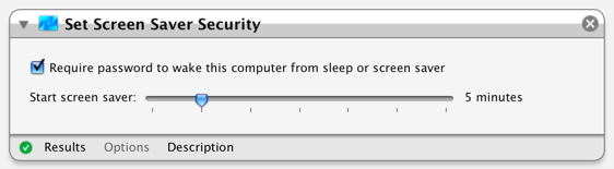
Black on White, White on Black
Command-Option-Control-8 will invert your screen. It’s a cool looking effect (and quite a prank if you do it to someone else’s machine), but most importantly it makes tiny-white-text-on-black webpages easier to read. Command Plus/Minus makes text larger/smaller, which helps too.
I’ve known for some time that dark text on a white background is most readable. But it until recently it was just “book learnin”. I’m young, my eyes are healthy, and I can read both color schemes just fine. I didn’t have proof I could see.
But I have trouble sleeping sometimes. A few days ago I had an “accident” with a 2L bottle of Mountain Dew and a late-night dinner of salty pizza. Look, the details of blame aren’t important here, the point is I didn’t get to sleep that night. Now, when you are very tired, it’s harder to focus your eyes — and having to focus them on a computer screen doesn’t help. About 3 in the afternoon it got downright painful to read trendy looking webpages with midnight backgrounds and petite white text. Remembering the color theory behind contrast, I gave Command-Option-Control-8 a shot, and holy shit, it worked! My screen looked like an adventure in black-lighting gone horribly wrong. But I could focus on those webpage’s text more clearly. Degraded vision from eye-fatigue gave me proof that I could see.
Now please don’t take this as anything but a biased anecdote. Trust the science, not me! But it was a neat (and painful) experience. I can see why Command-Option-Control-8 is there now. Give it a try sometime, and see if it helps for you. The most you have to lose is impressing any shoulder surfers with your computer wizardry. (Honestly though Command-Plus — make text bigger — will probably do more to enhance readability.)
Just in case you want to inver the screen programatically, this Apple Script will do the job:
tell application "System Events" to tell application processes to key code 28 using {command down, option down, control down}
February 10, 2009
Good engineering is necessary, but good design has a more direct impact on helping people do amazing things with computers
…the thinking that ultimately sunk Douglas Engelbart’s visionary but incredibly complicated OLS (online system): Engelbart didn’t consider it all that necessary to develop an easy-to-use interface because, he felt, people invested years in learning human languages, so why not invest 6 months in learning his system’s powerful, language-size command structure? It’s an interesting argument when you think about it that way, but it ultimately doomed his design to obscurity, while his proteges who left for Xerox PARC and designed a system people could learn to use in a hour went on to change the world. Frictionless user experience is paramount, engineering concerns are secondary.
The title this post is something I’ve been saying as part of my personal statement on hirevincent.com for years.
February 9, 2009
Resolution Independent Screenshots
Leopard includes technology that generates (mostly) resolution independent screenshots. That means when you enlarge the pictures, they won’t get pixelated, and more importantly, they will stay sharp when printed.
I don’t know if you’ve ever seen a printout of text mixed with a screenshot of text, but it looks like ass. That’s because even a very cheap printer is much higher resolution then your screen. It prints text very sharply. But when it prints the screen shot, it reproduces the low resolution display in high-fedelity — which actually makes it look worse. Plus, computers use tricks (eg sub pixel antialiasing) to make text look sharper on LCD screens — but those tricks can backfire on other media. A screenshot grabs exactly the pixels shown on the screen. And those pixels are optimized to be shown on a screen, not paper.
Example
Here’s an example screenshot (PDF). It looks like this:
If you open it, and zoom in, you will see that the text stays sharp, while some (but not all) of the interface gets pixelated.
How it Was Made
When Automator.app (click to open) saves a workflow, it puts a (mostly) resolution-independent screenshot of the workflow’s UI inside it. The screenshot is at SomeWorkflow.workflow/Contents/QuickLook/Preview.pdf. (In Finder, right-click a .workflow file, and choose “Show Package Contents” to look inside it).
If you print a workflow to a PDF file, it has the same limited resolution-independence. So I suspect Automator.app generates this PDF in much the same way files are printed. I have not investigated why the gray border is vectorized as well as the text. If anyone has an insight there, I’d love to hear it.
In the future, I expect text, and most UI elements, to be represented as vectors at every level of the OS. Screenshots will capture those vector-elements, as as they capture pixel-elements (pixels) today.
Google Monoculture
Google delivers 350x the traffic to Stack Overflow that the next best so-called “search engine” does. Three hundred and fifty times!
All I can say is that’s a Belgium big number!
Here’s his data:
Search Engine Visits 3,417,919 Yahoo 9,779 Live 5,638 Search 2,961 AOL 1,274 Ask 1,186 MSN 1,177 Altavista 202 Yandex 191 Seznam 103
The server logs for vgable.com, for 2008, show google giving me a much more modest 3.6x of my traffic.
|
|||||||||||||||||||||||||||||||||||||||||||||||||||||||||||||||||||||||
Of course, having 3.6x as much market share as everyone else combined is still market domination.
I can’t speculate why the numbers for my niche website are different from Attwood’s niche website (especially w.r.t Live Search).
But Yahoo’s consistently irrelevant 0.3% and 0.2% of referrals looks especially bad for them. Google has too few competitors.
No Ducking Way!
I’ve finally found an example of, someone intentionally typing “ducking” on their iPhone,
Plotting routes to meetings based on who I’m currently ducking. It’s good for exercise. Also that time iPhone was correct- I meant ducking.
Obviously we can’t have a spellchecker suggesting profanity. But is it really so wrong to just leave it alone? Can we trust that if someone says something that strongly they really meant it?
Word 2008 seems to try, bless it’s heart. It won’t suggest or correct, “Mike Lee” (at least when it’s written as two words).
But it still can’t stand one of the heavy seven (original MP3). Word gives it the scarlet underline. That strikes me as odd. I wish I knew the story behind it. Is it actually a dangerously common typo? Is it statistically more taboo? Did someone just make a Puritan judgement call, and decide people wanted to be corrected for writing it? (UPDATE 2009-11-18: apparently it is the worst swear word in the World, at least according to that cute story.)
Ask yourself, are obscenity filters a Bad Idea, or an Incredibly Intercoursing Bad Idea?
Color Blindness
Roughly 10% of men are color blind to some degree. You need to be sure your interfaces are accessible to them. (Unless you are designing exclusively for women I suppose, since women are about 20x less likely to be color blind.)
Sim Daltonism is the best way to test an interface on Mac OS X I’ve seen.
Here is a web-based colorblindness simulator. Here is another. Personally I prefer a native program though. It’s faster and more versatile.
If you are curious, you can test yourself for colorblindness. I have no idea how accurate that test is, but since different displays and operating systems usually show colors differently I’d be a little skeptical.
ADDITION 2009-10-11: WeAreColorBlind.com is a website dedicated to design patterns for the colorblind.
More Terms = More Specific (Assume AND, not OR)
Assumed-And is the way Google does it, with the more search terms added, the narrower the results. The other way around can be argued in the abstract, but your customers are not living in the abstract. The world has voted, and Assumed-And is the way it is. Having additional terms widen, rather than narrow, the scope confuses people in the extreme. They will leave you and find a site with a search function that “works.” This blunder alone could put a company out of business.