Oscar Pistorius, “The fastest man on no legs”, uses carbon-fiber prosthetic feet to run … apparently more efficiently then an able-bodied sprinter. And if he isn’t more efficient today, it’s a sure bet that technology will surpass mere flesh in the near future (at least in sprinting).
The cultural, ethical, and even technological, issues surrounding cyborg/transhuman athletes are fascinating.
The Genie is Out of the Bottle
Let’s be blunt, technology plays a roll in every sport today, and there is no going back.
Technology goes into equipment as basic as a shoe — making them lighter, springer, and more adhesive then anything humans have worn before.
The impact of better equipment was popularly recognized by at least the 1920s (if you have an earlier source please share),
Much of Improvement in Baseball Is Attributed to Evolution and Steady Progress of Mechanics and Invention
WHEN Babe Ruth hits three home runs in one game or the home team cracks out a barrage of base hits to score seven or eight times in one inning, it does not necessarily mean that long-distance hitting in modern baseball comes from superiority of today’s players over those of years past. The truth is that much of the improvement in the game itself and in the proficiency of its players has come from evolution and progress in science and invention.
—Popular Mechanics, May, 1924
Then there’s the elephant in the room: the athlete’s body, and the “stuff” that goes into it.
The prisoners dilemma essentially forces athletes to dope — because the only way to be sure your opponent does not have an advantage over you is to take advantage as well. (This is the best overview of the doping problem, and solution I have seen.)
But it’s not just drugs and steroids. There’s also nutrition, and sports medicine. Where exactly is the line between a supplement and a drug? More chemical sophistication goes into todays vitamins than the drugs of the past.
Modern training regimens and equipment seem to have more to do with the science of conditioning then the love of a sport. It’s interesting that someone who just played all day would be at a disadvantage compared to someone who used targeted exercise machines.
Genetic engineering might be the most interesting future trend to watch. Obviously genetics are a huge part of determining physical ability.
What do We Want?
We love to watch superhumans compete. Professional athletes are supermen, since they play significantly above average human ability.
But we also want a “fair” and “honorable” fight. I honestly don’t know exactly what it all means. It’s OK to have an unplanned genetic advantage. Drugs are bad, even if everyone has access to them. We love the underdogs the most, yet celebrate the winners who have the most funding going into their training.
What’s Sportsmanlike
It’s not whether you win or lose, it’s how you place the blame.
–Oscar Wilde
The problem with giving disabled athletes accommodations, like carbon fiber feet, is that they are only work until they start winning. Then accommodations become an unfair advantage. It doesn’t matter if they are unfair in reality, because they look unfair.
But there’s a quality of life problem with essentially saying, “you cripples can only play with the other cripples”.
Accommodations in the context of sportsmanship is a sticky issue, and I don’t pretend to have the answers. But I’m not necessarily against “play until you win”, as a lesser of many evils. Sometimes playing is more important then winning.
One analogue is gender differences. There is good reason behind having separate men, women, and weight categories for sports. But in recreational play, mixed gender teams are often the norm (Ultimate seems to work very well with mixed gender teams).
But there’s a good case to be made for letting “enabled” athletes to compete separately, but to their fullest — essentially making the Paralympics the Cyberlimpics.
Conclusion
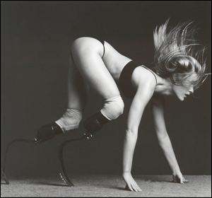
Maybe these pretty women will distract you from realizing I don’t have any answers, (Via Sensory Metrics):