Vincent Gable’s Blog

November 11, 2009

Just Look at it, Man!

Filed under: Bug Bite,Programming | , , , , , , , , ,
― Vincent Gable on November 11, 2009

You’re looking at Anscombe’s quartet: 4 datasets with identical simple statistical properties (mean, variance, correlation, linear regression); but obvious differences when graphed.
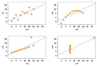
325px-Anscombe.svg.png


(via Best of Wikipedia)

Graphs aren’t a substitute for numerical analysis. Graphs are not a panacea. But they’re excellent for discovering patterns, outliers, and getting intuition about a dataset. If you never graph your data, then you’ve never really looked at it.

War Story

I was working on optimizing color correction, using SSE (high performance x86 instructions). One operation required division — an expensive operation for a computer. The hardware had a divide instruction, but sometimes using the Newton-Raphson method to do the division in software is faster. You never know until you measure.

While doing the measurement, I somehow got the crazy idea to try both: I’d already unrolled the inner loop so instead of repeating the divide or Newton’s Method twice, I’d do a divide and then use Newton’s Method for the next value. Strangely enough, this was faster on the hardware I was benchmarking than either method individually. Modern hardware is a complex and scary beast.

I was fortunate enough to have a suite of very good unit tests to run against my optimized code. But there was a caveat to testing correctness. Because computers don’t have infinitely precise arithmetic, two correct algorithms might give different answers — but if the numbers they gave were close enough to the infinitely precise answer (say a couple ulps apart) it was good enough. (We can only be exact within some Tolerance!) The tests cleared my hybrid divide/Newton-Raphson function: but we couldn’t use it, because it was fundamentally broken.

Even though the error was acceptably small, it had a nasty distribution. Using divide gave color values that were a bit too light. Doing a divide in software gave values that were a bit too dark. Individually these errors were fine. Randomly spread over the image they would have been fine. But processing every other pixel differently had the effect of adding alternating light/dark stripes! We see contrast, not absolute color, so the numerically insignificant error was quite visible. Worse still, bands of 1 pixel stripes combined to form a shimmering Moiré pattern. It was totally busted. Unusable.

This was all immediately obvious when the results of the color correction were “graphed”. Actually looking at the answer caught a subtle error that our suite of unit tests missed.

To be clear, more subjective graphical analysis is not a substitute for numerical analysis and data mining. But I believe in actually looking at your data at least once. A graph is a kind of end-to-end visualization of everything, and that has value. Graphs are a cheap sanity check — does everything look right? And sometimes, they can give you real insight into a problem.

October 6, 2009

‘Yum!’

Filed under: Design,iPhone,MacOSX,Programming | , , , , ,
― Vincent Gable on October 6, 2009

I give Microsoft’s current Mac software some shit, but I think it’s deserved. So it’s only fair I mention their glory days.

From “Classic” Mac OS 8.1 in 1998 through Mac OS X 10.2 Microsoft’s Internet Explorer (for Mac) was the default web browser Apple chose for Mac OS. The very fist iMac? It came with IE:mac, just like the first version of Mac OS X.

And IE:mac wasn’t so bad, for it’s era. (It was the first browser to have color correcting PNGs, by the way!) There was one really neat feature that I think is worth calling out: it would match your iMac’s color, automagically.

Technical Details That I Only Half Remember

If you have a better understanding of how this worked, please let me know! I couldn’t find any details online. Mostly, I’m writing down what I remember before I forget.

The poorly named Gestalt function lets you check information about the Mac OS runtime, like “what version of Mac OS is this?“. You pass it a FourCharCode, and replies with a 32-bit value or an error code — old stuff from the “Classic” Mac OS days.

There was an undocumented code, 'yum!' 1, that returned the color of an the iMac or iBook case. IE:mac would check this when it first started, and choose a color scheme to match the operator’s Mac. It was a seamless personal touch that really impressed me.

It’s the sort of thing I’d like to see more of on today’s multi-colored iPods and iPhones.

1It might have been 'Yum!', I don’t remember exactly, and Gestalt() returns gestaltUndefSelectorErr, -5551, for all of variations on my MacBook Pro under Snow Leopard.

July 17, 2009

Color Me Explosive

Filed under: Design,Quotes | , , , , ,
― Vincent Gable on July 17, 2009

From Wikipedia, a story of color-coding gone horribly wrong in Afghanistan,

HDRs (Humanitarian Daily Rations) are typically air-dropped into the disaster area on large pallets. The HDRs initially dropped in Afghanistan were yellow, before it was realized that the packages were the same color, and approximately the same size, as American cluster bombs, which were also dropped in Afghanistan.[1] Later packages were made in an orange-pink color described as “salmon“.[3]

(Emphasis mine, some links altered, perminant link to the quoted Wikipedia revision.)

I’ve written before about pitfalls of color coding.

February 11, 2009

Black on White, White on Black

Filed under: Announcement,MacOSX,Sample Code,Tips,Usability | , , , ,
― Vincent Gable on February 11, 2009

Command-Option-Control-8 will invert your screen. It’s a cool looking effect (and quite a prank if you do it to someone else’s machine), but most importantly it makes tiny-white-text-on-black webpages easier to read. Command Plus/Minus makes text larger/smaller, which helps too.

I’ve known for some time that dark text on a white background is most readable. But it until recently it was just “book learnin”. I’m young, my eyes are healthy, and I can read both color schemes just fine. I didn’t have proof I could see.

But I have trouble sleeping sometimes. A few days ago I had an “accident” with a 2L bottle of Mountain Dew and a late-night dinner of salty pizza. Look, the details of blame aren’t important here, the point is I didn’t get to sleep that night. Now, when you are very tired, it’s harder to focus your eyes — and having to focus them on a computer screen doesn’t help. About 3 in the afternoon it got downright painful to read trendy looking webpages with midnight backgrounds and petite white text. Remembering the color theory behind contrast, I gave Command-Option-Control-8 a shot, and holy shit, it worked! My screen looked like an adventure in black-lighting gone horribly wrong. But I could focus on those webpage’s text more clearly. Degraded vision from eye-fatigue gave me proof that I could see.

Now please don’t take this as anything but a biased anecdote. Trust the science, not me! But it was a neat (and painful) experience. I can see why Command-Option-Control-8 is there now. Give it a try sometime, and see if it helps for you. The most you have to lose is impressing any shoulder surfers with your computer wizardry. (Honestly though Command-Plus — make text bigger — will probably do more to enhance readability.)

Just in case you want to inver the screen programatically, this Apple Script will do the job:
tell application "System Events" to tell application processes to key code 28 using {command down, option down, control down}

February 9, 2009

Color Blindness

Filed under: Accessibility,Design,MacOSX,Programming,Usability | , , , ,
― Vincent Gable on February 9, 2009

Roughly 10% of men are color blind to some degree. You need to be sure your interfaces are accessible to them. (Unless you are designing exclusively for women I suppose, since women are about 20x less likely to be color blind.)

Sim Daltonism is the best way to test an interface on Mac OS X I’ve seen.

Here is a web-based colorblindness simulator. Here is another. Personally I prefer a native program though. It’s faster and more versatile.

If you are curious, you can test yourself for colorblindness. I have no idea how accurate that test is, but since different displays and operating systems usually show colors differently I’d be a little skeptical.

ADDITION 2009-10-11: WeAreColorBlind.com is a website dedicated to design patterns for the colorblind.

January 30, 2009

Color is Cultural

Filed under: Design,Usability | ,
― Vincent Gable on January 30, 2009

An Asian student in my laboratory was working on an application to visualize changes in computer software. She chose to represent deleted entities with the color green and new entities with red. I suggested to her that red is normally used for a warning, while green symbolizes renewal, so perhaps the reverse coding would be more appropriate. She protested, explaining that green symbolizes death in China, while red symbolizes luck and good fortune. The use of color codes to indicate meaning is highly culture-specific.

Information Visualization, Second Edition: Perception for Design, page 16 (via Keith Lang)

I hypothesize that color-codings derived from nature and physics (for example more and less mapping to hotter and colder colors) would work across cultural divides. But maybe that’s just the science-worshiping American in me talking.

UPDATED 2009-02-02: There’s some very good commentary on this post. My hypothesis was wrong, or at very least missed the real difficulty of color coding. Also, it now appears the anecdote was not real culture shock, but a smart student defending their design with the first thing they could think of when it was suddenly challenged.

May 27, 2008

Readable Colors

Filed under: Accessibility,Design,Usability | , ,
― Vincent Gable on May 27, 2008


…the most readable color combination is black text on white background; overall, there is a stronger preference for any combination containing black. The two least readable combinations were red on green and fuchsia on blue.

Also, in every color combination surveyed, the darker text on a lighter background was rated more readable than its inverse (e.g. blue text on white background ranked higher then white text on blue background).

I wish Columbia Blue and Red were tested in the survey. They were my high school’s colors; and they were terrible. The worst permutation was blue text on a red background.

Question for all you who prefer light source-code on a dark background: why do you like it?

Powered by WordPress