Vincent Gable’s Blog

July 19, 2009

For iPhone and or iPod Touch and or Other Things As Well

Filed under: Announcement,iPhone,MacOSX | , , , , , ,
― Vincent Gable on July 19, 2009

It’s very clear that a program “for Mac OS X” works with any personal computer Apple sells, because they all have “Mac” in their name. Unfortunately, the flavor of OS X that runs on the iPhone and iPod Touch is officially called “iPhone OS” by Apple, which it implies an incompatibility with the iPod Touch, and any future device that doesn’t have “phone” in the name.

I don’t know a good way to unambiguously say that a program is for any iPhone OS device, without tedious enumeration.

“For iPhone OS” sounds like it excludes the iPod Touch.

“For all models of iPhone and iPod Touch” sounds terrible. It will sound even worse when Apple comes out with other iPhone OS devices (“…for iPhone or iPod Touch or iTablet or iFPGA…”).

Apple could help by renaming “iPhone OS” to “Mobile OS X”, but I don’t see this happening.

I personally lean towards using “for iPhone” in general writing, and clarifying, if necessary, in “systems requirements” fine print. This feels closest to how the press covers iPhone OS applications, and of course it’s how Apple named the OS.

I’d love to hear what you call iPhone OS applications, and why.

July 14, 2009

Dozen Page Impression: Design your Life

Filed under: Accessibility,Announcement,Design,Usability | , , , ,
― Vincent Gable on July 14, 2009

I had some time to kill today, waiting for a catalytic converter replacement, and the book Design Your Life: The Pleasures and Perils of Everyday Things caught my eye. It’s loosely about about the value of design and how to apply UX to everyday life. I’ve only read1 a dozen or so pages of it in a bookstore, but so far I definitely recommend the book.

Visually it’s is appealing (but of course it has to be!), and accessibly written.

But what really impressed me the most, is that it gives you a critical eye and a reason to ask ‘why?’. And I think that’s the most important thing you can get out of a book on UX/design/accessibility.

The authors also have have a website which looks to be every bit as good as the book.


1You’re probably wondering why I didn’t buy the book if I like it enough to recommend it. Well, I had my iPhone with me in the store, and I looked up the price on amazon. It was half what the brick-and-mortar store was asking. So I didn’t buy it. Speaking of which, if you order the book through any of the links on this page, I get a small commission from Amazon. So please do doubt my recommendation — that’s what critical thinking is all about!

June 11, 2009

Early Adopters Wanted!

Filed under: Announcement,iPhone | , , ,
― Vincent Gable on June 11, 2009

I am wrapping up work on Prometheus, an iPhone app that edits the Simple English Wikipedia.

Unfortunately, I am having trouble finding people to take the pre-release version for a spin, and tell me what they think. I want to be sure I’ve fixed any glaring issues before I push my work out to the App Store.

If you are interested in helping, please visit the Prometheus webpage.

Thank you!

June 4, 2009

links for 2009-06-04

Filed under: Announcement,iPhone,Programming,Quotes,Research,Usability
― Vincent Gable on June 4, 2009

This was an experiment, in doing more with my delicious bookmarks. I was hoping that I could get more feedback and discussion on things I found interesting enough to bookmark by automatically posting links to them here. Many sites that I enjoy reading do something similar. But it hasn’t felt like a good fit for me.

April 27, 2009

Don’t Trust TIME

Filed under: Announcement,Security | , , ,
― Vincent Gable on April 27, 2009

Technical problems can be remediated. A dishonest corporate culture is much harder to fix.

Bruce Schneier

UPDATE 2009-06-12: See also, The Top 10 Most Absurd Time Covers of The Past 40 Years.

BREAKING NEWS 2010-08-26: The Onion: TIME Magazine Announces New Version of Magazine for Adults.

Recently The 2009 TIME 100 Finalists online-poll was manipulated with hither-to unheard of sophistication. Not only did hackers vote their choice into the #1 spot, but they stuffed the ballot so that the runners up spelled out a message!

kg9kl.jpg

Jeff Atwood called TIME’s web developers clowns, but that seems too harsh to me, since online polls are so inherently untrustworthy that spending resources trying to secure them is almost always a waste. Even if all the technical problems could be solved, the results still wouldn’t be meaningful, because they wouldn’t be a census or a random sampling. An online poll is a way to engage readers, and let them do more than passively consume. TIME’s poll succeeded there, even if it was gamed. (Arguably it was more engaging because it was gamed).

But today, April 27th, TIME’s writers disingenuously denied the hack

TIME.com’s technical team did detect and extinguish several
attempts to hack the vote.

When I first heard news of the attacks, it was already a week old, TIME’s whitewashing came two weeks after the results of the hack were published. Portraying the hack as an “attempt” that was “extinguished” is just blatantly wrong.

I’m a big believer in Hanlon’s razor: “never attribute to malice that which can be adequately explained by stupidity.” But it’s very hard to give TIME’s staff the benefit of the doubt here, since by their own admission they were aware of the hack, and the poll results were “surprising”. It takes a staggering amount of stupidity not to connect the dots, or be aware of what was being written about you for weeks.

Consequently, TIME has lost my trust. If their denial was written in stupidity, it shows an unforgivably incompetent journalistic ethic. If it was a deliberate whitewashing of the poll results, then it’s an even more egregious failure. Also, what kind of an article announcing the winner of a poll only has pictures of people who are not the winner? (Hint: something by the hacks at TIME)

April 18, 2009

Too Fabulous For Me

Filed under: Announcement | ,
― Vincent Gable on April 18, 2009

I bring this up, because it’s an example of when branding has caused me to pass on buying a product I otherwise liked.

Tab Energy is the best tasting diet energy drink I’ve had. Period. To me it had a pomegranate flavor, but I’ve heard it described as “jolly rancher” and “watermelon”.

It’s expensive, even within the it’s-so-over-priced-you-should-just-take-some-pills-and-juice-instead1 energy drink market. But the real shame, for me, is the fabulous branding. It’s not just gender issues, there’s nothing about the lifestyle the advertising promotes that I can embrace. Judge harshly for yourself,

So I’ve never put a pack of it in my shopping cart. Very rarely I’ve picked up single servings from convince stores — unlike the boxes, the cans don’t have “You go, Girl!” and “Shop till you drop!” printed on the front. I haven’t had a Tab Energy in over a year and a half.

1Caffeine pills and B-vitiman supplements are an order of magnitude cheaper.

April 10, 2009

Pre-announcing Prometheus

Filed under: Announcement,iPhone | , , ,
― Vincent Gable on April 10, 2009

For the past month I have been working on my first iPhone application, code-named Prometheus. It’s a dedicated editor for Simple English Wikipedia.

Simple Wikipedia

The Simple English Wikipedia is a wikipedia written in simplified English, using only a few common words, simple grammar, and shorter sentences. The goal is for it to be as accessible as possible. That’s something that really resonates with me. There are many reasons why I think it’s an important project, but I’ll only briefly mention one sappy example.

Children can’t understand all of the Grown Up Wikipedia. Simple Wikipedia helps put more knowledge within their reach. I started writing weekly reports in the 5th grade. I’m sure many schools make students start sooner, and certainly I had to write infrequent reports much earlier. An encyclopedia at a 4th grade reading level would have been a fantastic tool to learn more about the world.

Prometheus

In Greek mythology Prometheus was, “the Titan god of forethought and the creator of mankind. He cheated the gods on several occasions on behalf of man, including the theft of fire.”

Similarly, the Prometheus iPhone app brings knowledge from the American-English Wiki Gods the to the majority of the world that does not speak English natively.

Given the platform, I believe enabling small quick edits is the best way to go. I want to make it easy for a native English speaker to spend 30 seconds correcting grammar while waiting in line.

With more constrained language, writing-aids become even more helpful. Surprisingly, I find myself using a thesaurus more when writing Simple English, to be sure I’m using the clearest synonym I can. There’s a lot more an application like Prometheus can do to help, because it’s not targeting a complex language.

Roadmap

I’ll be brutally honest, the first release is not going to have any fancy analytical features I originally envisioned. My goal is to get a 1.0 release out quickly, then iterate on the feedback and what I learn. I also have a selfish motivation here, because I’m looking for a job, and not having something in the App Store yet has been a big barrier.

What I can promise for 1.0 is

  • A greatly streamlined interface, as compared to editing through Safari.
  • A safe, save-free, experience, where nothing you write is lost if you suddenly have to quit and do something else.
  • Shake to load a random page. (Look, I know that’s nothing to brag about. But it is something Safari can’t do.)
  • A $0 price tag.

I’m trying to have 1.0 ready in about a moth, but that’s an aggressive goal.

Beyond that I would like to add a “simple-checker” that can flag complex terms, and a mechanism for as-you-type suggestions of more common terms. But both of these are technically challenging, and my main priority will be building on what I’ve learned by putting something in front of people.

Teaser

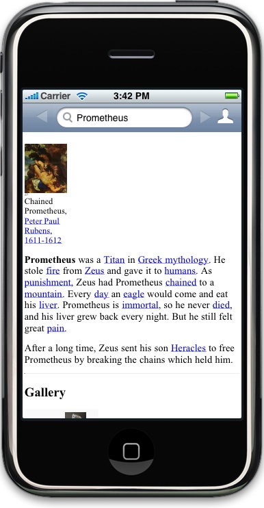
Here’s a picture of what I have running today.

prerelease.jpg

I have a lot to say about the evolving design in future posts. But this should an you an idea of what I’m shooting for — as minimal an interface as I can manage, hopefully condensed into one toolbar.

I don’t have an icon yet, if you can help there please let me know. Unfortunately this is a free project all around, so I’m not in a position to hire someone. My current idea for an icon is a hand
holding a fennel stalk with fire inside, much like an olympic torch. I’d love to hear your ideas.

March 6, 2009

A Good Basic Computer Science Book

Filed under: Announcement,Programming,Tips | , , , ,
― Vincent Gable on March 6, 2009

In high school, I literally wore out my copy of The New Turing Omnibus: Sixty-Six Excursions in Computer Science. The graphics topics are dated, and there is no discussion about newfangled topics in computing, like the internet. But the meat of the book are timeless computer science fundamentals. It still has the best explanation of what “NP-Complete” means (page 276) that I’ve run across.

The book covers some dense territory, but is still fairly accessible. When my mother asked me, “how can a computer make a random number, if it only does what it’s told?” I pointed her to the chapter 8, “RANDOM NUMBERS: The Chaitin-Kolmogoroff Theory” (page 49). The math was a bit over her head, but she could still read the chapter, and it answered her question. I recommend it to The New Turing Omnibus, without reservation, to anyone who’s considering Computer Science.

What are your favorite introductory Computer Science books?

Patrick Thomson suggests Godel, Escher, Bach: An Eternal Golden Braid. It’s an excellent and fun introduction to the essential theory behind computer science.

Here is an excellent overview of the current state of the P=NP question.

February 24, 2009

More Flash Hate and Graceful Degradation

Filed under: Accessibility,Announcement | , , , ,
― Vincent Gable on February 24, 2009

Adobe’s website for Air (their cross-platform ‘web for the desktop’ technology) requires Flash 10. If you have an earlier version of Flash, like 75% of the visitors to my website, then you see a big blank box.

This is a terrible mistake for the company that makes Flash. In no way does it inspire confidence that Flash is accessible.

The real irony is Adobe’s own website was the first website I’ve seen that was incompatible with the version of Flash I was using. If other websites leveraged Flash 10, they gracefully degraded so that I could use them with Flash 9.

When I finally upgraded, I couldn’t see why Adobe’s website needed Flash 10 was required. I wasn’t wowed. All I saw was some fancy transitions between slow-loading flash videos.

Just by being open, that one website used 125% of my CPU even when I wasn’t interacting with it. No joke, 125% is what OS X reported. I am using a dual core machine, so the 125% means that 100% of one CPU, and 25% of another were used — just to render a webpage I wasn’t even looking at.

Is Adobe fine with alienating 75% of the internet?

Why can’t they make their own website laptop friendly?

Why should I trust their new Air platform that “lets developers use proven web technologies” if its own website won’t just work for me?

February 23, 2009

Why You Need A Blogging Program

Filed under: Announcement | , ,
― Vincent Gable on February 23, 2009

I highly recommend using a desktop blogging program. Obviously they make blogging easier, but more importantly they remove friction from recording and sharing your great ideas.

I use MarsEdit to write this blog. Honestly I don’t know if there’s something better out there. I tried it because it was mentioned by people I read. It worked well enough for me that I never went looking at competing programs, and when the free trial was up I paid for it.

All of the Internet’s Strengths, None of its Weaknesses

Some benefits of using a desktop blogging program are obvious. You can do everything you can do with your blog’s web interface and more. The whole writing experience is just a bit more snappy and polished when you take full advantage of the computer you’re writing on with a native application.

Getting the Computer Out of Your Way

But the less-obvious benefit is that a blogging program makes it easier to jot down ideas. Whenever you want to write something, you just hit “New Post” and start writing. You don’t have to name or categorize your post until the time is right. That may not sound like a big deal, but it’s huge in practice. As John Gruber explains in detail, having to deal with the filesystem just to jot down an idea is a lot of friction.

…(the) problem is that the mental friction posed by the Save dialog often keeps you from ever even creating or saving small items of data in the first place.

MarsEdit lets me just start typing when I have a new idea; and quickly find old ideas when I want to build on them.

Do Something With Your Ideas

There are lots of dedicated “notes” applications that “get the computer out of the way”. Blogging apps are superior to all of them, because they make it easier to do something with your ideas. Using another program to keep track of ideas is another barrier to actually publishing them.

You might not want to share every idea, and that’s fine! Just because you’ve written it down in a blog editor does not mean you have to hit “post”. I would love it if you built your secret idea and got rich off it. No lie. If you make something amazing enough to make a fortune, then you’ve made a difference in people’s lives. And I think that makes the world a better place.

But for most ideas, an essay is still the best way to change the world, because it’s the best way to change millions of peoples minds. Using separate programs to track and publish of ideas is another barrier to actually publishing them. Blogging programs make it easier to get the most out of everything you write by removing this barrier.

« Newer PostsOlder Posts »

Powered by WordPress