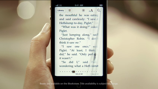
…one particularly outrageous moment stuck out for me. At about three minutes into the video, senior vice president for iPhone software Scott Forstall extolls the virtues of the Retina Display by declaring that “The text… is just perfect!” Meanwhile, the central image in the video at just that moment is this little typographic calamity:
I urge you to fast-forward the time code to 3:02 to hear this for yourself. Forstall is quite literally claiming perfection while a hand model holds up this terrible example of everything that’s wrong with Apple’s commitment to typography. While the letterforms on that virtual page may look gorgeous, it’s apparent to any designer that the text is far from perfectly typeset. It’s hideous, scarred as it is by unsightly “rivers” of bad spacing within the text. No self-respecting typographer would dare call that perfect.
The unrelenting drive for perfection was a quality I always admired in Apple. I hope this is just bullshit spin, and an unfortunate choice of sample frames.
