Vincent Gable’s Blog

May 19, 2009

Improving Twitter.com: Space to Work

Filed under: Design,Sample Code,Tips,Usability | , , , , ,
― Vincent Gable on May 19, 2009

The Change

Enlarge the “What are you doing” box on Twitter.com, to make compressing substantial ideas easier.
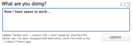
Twitter.com with a larger text-field

Motivation

I’ve been disappointed with the posting interface of every Twitter-client I’ve tried so far. Just like any writing, tweets start with a first draft. My first drafts are often longer than 140 characters. That shouldn’t be a problem; trimming the fat is part of any editing process. But most Twitter-interfaces are so downright hostile to anything longer then 140 characters that trimming a 145 letter utterance is a frustrating study in fighting my tools.

(The worst client I tried was, Blogo, which would stop you from typing and yell at you with a dialog if you dared press another key after typing 140 characters. But Twitterrific was little better; I don’t understand how something so user-unfriendly became so popular.)

Even Twitter.com doesn’t give you enough room for writing a long, but under-the-limit tweet. To see for yourself, just start typing “mmmmm”; the box will run out of room before you run out of characters. It’s downright crazy to have to scroll to see all of a tweet you are writing.

Now there’s nothing wrong with trying to prescribe a pithy style of communication. Clearly Twitter wouldn’t have worked otherwise. But punishing users for doing the “wrong” thing isn’t as effective as giving them the tools to change their behavior, to wit: space to work on shortening their writing.

The Code

This CSS code makes the direct-messaging, and “what are you doing?” text-boxes tall enough to hold 5 lines of text without scrolling. By default Twitter’s web interface only holds 2 lines of text on screen.

#dm_update_box #direct_message_form fieldset div.info textarea#text,
#status_update_box #status_update_form fieldset div.info textarea#status {
	height: 6em !important;
}

The selectors I used are pretty specific to Twitter.com, so it’s unlikely this will interfere with another site’s layout, unless it’s HTML code is nearly identical to Twitter’s.

How-To: Safari

Copy the above code into a .css file, (“CustomSafari.css” is what I called mine) then select that file in Safari -> Preferences -> Advanced -> Style sheet:
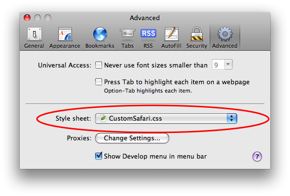
safariStyleSheet.png

After restarting Safari, Twitter’s web interface should give you room to work.

May 1, 2009

NSXMLParser and HTML/XHTML

Filed under: Bug Bite,iPhone,Objective-C,Programming | , , , ,
― Vincent Gable on May 1, 2009

NSXMLParser converts HTML/XML-entities in the string it gives the delegate callback -(void)parser:(NSXMLParser *)parser foundCharacters:(NSString *)string. So if an XML file contains the string, "&lt; or &gt;", the converted string "< or >" would be reported to the delegate, not the string that you would see if you opened the file with TextEdit.

This is correct behavior for XML files, but it can cause problems if you are trying to use an NSXMLParser to monkey with XHTML/HTML.

I was using an NSXMLParser to modify an XHTML webpage from Simple Wikipedia, and it was turning: “#include &lt;stdio&gt;” into “#include <stdio>“, which then displayed as “#include “, because WebKit thought <stdio> was a tag.

Solution: Better Tools

For scraping/reading a webpage, XPath is the best choice. It is faster and less memory intensive then NSXMLParser, and very concise. My experience with it has been positive.

For modifying a webpage, JavaScript might be a better fit then Objective-C. You can use
- (NSString *)stringByEvaluatingJavaScriptFromString:(NSString *)script to execute JavaScript inside a UIWebView in any Cocoa program. Neat stuff!

My Unsatisfying Solution

Do not use this, see why below:

- (void)parser:(NSXMLParser *)parser foundCharacters:(NSString *)string;
{
	string = [string stringByReplacingOccurrencesOfString:@"<" withString:@"&lt;"];
	string = [string stringByReplacingOccurrencesOfString:@">" withString:@"&gt;"];

	/* ... rest of the method */
}

Frankly that code scares me. I worry I’m not escaping something I should be. Experience has taught me I don’t have the experience of the teams who wrote HTML libraries, so it’s dangerous to try and recreate their work.

(UPDATED 2009-05-26: And indeed, I screwed up. I was replacing & with &amp;, and that was causing trouble. While my “fix” of not converting & seems to work on one website, it will not in general.)

I would like to experiment with using JavaScript instead of an NSXMLParser, but at the moment I have a working (and surprisingly compact) NSXMLParser implementation, and much less familiarity with JavaScript then Objective-C. And compiled Obj-C code should be more performant then JavaScript. So I’m sticking with what I have, at least until I’ve gotten Prometheus 1.0 out the door.

January 23, 2009

Never Submit

Filed under: Bug Bite,Design,Programming,Usability | , ,
― Vincent Gable on January 23, 2009

Submit is always the wrong title for a button. Yet it’s still commonly used, even by people who should know better. I had “Submit Comment” buttons on my blog when I first published this.

Buttons should say what happens when they are pushed, in the vocabulary of the person pressing them. Technically a button might submit a form to a server, but what matters is the consequence of submitting the form.

For example,

Picture 27.png

this button should be called “Search” or “Find” or “See Matches” — something that describes what happens when it is pressed, or what the operator will see after pressing it.

That’s a Bad Word

“Submit” has negative connotations, and should be avoided. The first three example usages (in Mac OS X’s Dictionary.app) are all negative,

submit

verb
1 [ intrans. ] accept or yield to a superior force or to the authority or will of another person : the original settlers were forced to submit to Bulgarian rule.

• ( submit oneself) consent to undergo a certain treatment : he submitted himself to a body search.

• [ trans. ] subject to a particular process, treatment, or condition : samples submitted to low pressure.

Say an apartment takes applications on their website. It would be pedantically correct to say “Submit Application”. But it is more respectful to say “Send Application”, or “Apply”. Pressing a “Submit” button implicitly says “I submit”. And that’s the wrong relationship for a user to have to an interface.

Blame The Programmers (Not Really)

One reason so many buttons are labeled “Submit” is that the HTML code for making a button has the word “submit” in it. The code for is <input type="submit" value="This Button">.

If the keyword send was used to build buttons, I would argue that the web would be a slightly less intimidating place today. A button that demands you “send” something is better then a button that forces you to “submit”.

Choose Your Words Carefully…

So perhaps, when choosing programming terms, we should pick the ones with the fewest negative connotations, since inevitably some of those words will bleed over into user-land. Even if programmer words stay in programmer-land, word-choice influences the way we think about things. Best not to encourage berating your users and customers.

Of course, you shouldn’t go overboard avoiding “ungood” words! There is no question that the most clear term should be used (even if it’s offensive). A better programming-vocabulary means better, less buggy, programs. And that’s better for users (no matter what they are called behind their back). But if possible, avoid disparaging words.

And never submit to the temptation of calling a button “Submit”. There’s always a more accurate, respectful name.

June 20, 2008

Modern Browsers

Filed under: MacOSX,Programming,Quotes | , , , ,
― Vincent Gable on June 20, 2008

… What struck me watching these (WebKit) demos is that you could build a really slick web app UI using stuff like the canvas tag, SVG, and advanced CSS. Yes, none of this stuff works in IE, and IE still has massive market share — but not among the sort of people who adopt hip new web apps. The combined market share for, say, Firefox 3 and Safari 3 is larger than the overall market share for Mac OS X. Plenty of developers write desktop software that only works on the Mac — why aren’t more people writing apps web apps that only work in truly modern web browsers? The first one to do it is going to be a sensation.

John Grubber

I didn’t have a sense for how far behind IE lags, historically and today, until I saw this compatibility table (via Toby Jungen),

Calculation of support of currently displayed feature lists

Internet Explorer Firefox Safari Chrome Opera
Far Past 6.0: 4% 2.0: 34% 3.1: 43% 0.2: 54% 9.0: 35%
Past 7.0: 12% 2.0: 34% 3.1: 43% 0.2: 54% 9.0: 35%
Present 8.0: 29% 3.0: 48% 3.2: 67% 1.0: 54% 9.6: 58%
Near Future (2009) 8.0: 29% 3.5: 78% 4.0: 88% 2.0: 84% 10.0: 63%
Future (2010 or later) 9.0: 29% 4.0: 86% 4.*: 88% 2.0: 84% 10.*: 72%

Powered by WordPress