Vincent Gable’s Blog

June 22, 2009

(Hyper)Text is King of Substance

Filed under: Accessibility,Design,Quotes,Usability | , , , , ,
― Vincent Gable on June 22, 2009

…I’d rather have the text of Clay’s speech than the video. For things that matter, written words are unambiguously better than speech. To start with, anything that matters isn’t just written, it’s usually rewritten repeatedly (and more important, condensed). Plus, it has hyperlinks. Plus, it’s smaller and cheaper to ship around. Plus, it’s searchable. Plus, it works on more devices. (I acknowledge that only the first of these is fundamental; but that alone would be enough).

Tim Bray

Videos, speech, etc. will always carry more emotional content. But for consuming ideas, text offers the highest bandwidth and most precision. Unfortunately, writing well takes time, and can hinder conversation.

Conceptually, I believe illustrative pictures and infographics are valid elements of modern text, like links, or typography.

June 19, 2009

All’s Well That Ends Well

Filed under: Design,Quotes,Usability | , , , ,
― Vincent Gable on June 19, 2009

the peak end rule. When thinking about a total experience, people tend to place too much weight on the last part of the experience. In one experiment, people had to hold their hands under cold water for one minute. Then, they had to hold their hands under cold water for one minute again, then keep their hands in the water for an additional 30 seconds while the temperature was gradually raised. When asked about it afterwards, most people preferred the second option to the first, even though the second had more total discomfort. (An intrusive medical device was redesigned along these lines, resulting in a longer period of discomfort but a relatively comfortable final few seconds. People liked it a lot better.)

Bruce Schneier

June 4, 2009

links for 2009-06-04

Filed under: Announcement,iPhone,Programming,Quotes,Research,Usability
― Vincent Gable on June 4, 2009

This was an experiment, in doing more with my delicious bookmarks. I was hoping that I could get more feedback and discussion on things I found interesting enough to bookmark by automatically posting links to them here. Many sites that I enjoy reading do something similar. But it hasn’t felt like a good fit for me.

June 1, 2009

Pass Phrases, Not Passwords

Filed under: Accessibility,Research,Security,Usability | , , , ,
― Vincent Gable on June 1, 2009

Thomas Baekdal makes a convincing argument for using pass-phrases not passwords (via). It’s excellent advice, and I know I’m not alone in having advocated it for years.

My keyboard has 26 letters, 10 numbers, and 12 symbol keys, like ~. All but spacebar make a different symbol when I hold down shift, giving me 93 characters to use in my passwords. But the number of words that can make-up a pass-phrase is easily in the 100,000s. Estimating exactly how big is a bit tricky, but I will stick with 250,000 here (I think it’s an undercount, more on this later).

We Know How To Talk

The human brain has an amazing aptitude for language. But “passwords” aren’t really words, so they don’t tap into this ability. In fact, we often use words to try and remember the nonsense-characters of a password.

Wouldn’t it make more sense to just use the words directly, if we can remember them more easily?

Hard For Computers, Not Hard For Us

People feel that if security system A is harder for them to use then system B, then A must be harder for an attacker to bypass. But the facts don’t always match this intuition.

What authentication code do you think is harder for a bad guy to hack, the 7 character strong password “1Ea.$]/”, or the mnemonic for the first 3 characters, “One Elvis Amazon”? Certainly “1Ea.$]/” is harder for a person to remember. It feels like it should be harder to break. But a computer, not a person, is going to be doing the guessing, and all it cares about is how big the search space is. There are 937 possible 7 character passwords. Let’s say there are 250,000 possible English words (more on that figure later). Then there are 250,0003 3 word combinations — meaning an attacker would have to do 260 times more work to guess “One Elvis Amazon” than to guess “1Ea.$]/”.

With pass phrases, easier for the good guys is also harder for the bad guys.

Exactly How Much Harder

The “250,000 word” figure is a bunch of hand-waiving, but I believe it’s an undercount. I picked it, because I wanted a round number to crunch; it’s what Thomas Baekdal picked; and it’s about the size of the Mac OS X words file,

$ wc -l /usr/share/dict/words 
  234936

But liberally descriptive linguists say that the 1,000,000th word will be added to the English Language on June 10th, 2009. The more conservative Webster’s Third New International Dictionary, Unabridged list 475,000 English words. Obviously neologisms, slang, and archaic terms are fine for pass phrases. People like discovering quirky words. I see far more more people embracing the login, “kilderkin of locats”, then rejecting it.

Different conjugations (can) count as different words in pass-phrases. There’s only one entry in a dictionary for swim, but swim, swimming, swam, etc. make for distinct pass-phrases (eg. “Elvis swims fast”, “Elvis swam fast”, etc. Both phrases don’t show up in a google search by the way.) So the real number of words should be a few fold larger than a dictionary indicates.

But not all words are equally likely to be chosen — just as some characters are more popular in passwords. My earlier figure of “2500003 3 word combinations” was based on the naive assumption that each of the 3 words is independent. But people do not pick things at random. And a phrase is by definition not completely random — it must have some structure. I’m unaware of research into exactly how predictable people are when making-up pass-phrases.

But given how terrible we are at picking good passwords, and how good we are at remembering non-nonsense-words, I am optimistic that we can remember pass-phrases that are orders of magnitude harder to guess than the “good” passwords we can’t remember today.

Fewer Ways To Fail

We’ve all locked ourselves out of an account because of typos or caps lock. But pass-phrases can be more forgiving.

Pass-phrases are caseinsensitive. There’s no need to lock someone out over “ELvis…”.

Common typos can be auto-corrected, much as google automatically suggests words. Consider the authentication attempt “Elvis Swimmms fast”. The system could recognize that “Swimms” isn’t a word, and try the most likely correction, “Elvis Swimms fast” — if it matches, then there’s no reason to ask the user if it’s what they really meant. (Note that only one pass-phrase is checked per login attempt.) I don’t have hard data here, but given how successful google is at interpreting typos, I’d expect such a system to work very well.

Pass-phrases might be more difficult on Phones, and similarly awkward to write with devices. Writing more letters means more work. Predictive text can only do so much. Repeatedly typing 3 letters and accepting a suggestion is clearly more work then just tapping out 6 characters. Additionally, there are security concerns with a predictive text system remembering your pass-phrase, or even a small part of it.

But for computers, pass phrases look like a clear usability win.

Easily Secure Conclusion

(In case you were wondering that was a unique phrase when I wrote this.) Using pass-phrases over passwords (which are really pass-strings-of-nonsense-sybols-that-nobody-can-remember) makes a system significantly harder to crack. Pass-phrases are easier for humans to remember, and a system that uses them can be very forgiving. But as always, the devil is in the details. It’s terrifying to be an early adopter of a new security practice, even if it seems sound.

May 29, 2009

Don’t Waste Memory to Save Time

Filed under: iPhone,MacOSX,Programming,Usability | , , ,
― Vincent Gable on May 29, 2009

In the provocatively titled, Space is Time: How Your CS Theory Class Lied to You, Greg Parker explains why hogging memory to speed up your program is a bad idea on consumer-level devices.

Space is time. An optimization that makes your program faster may make the user’s system slower overall. Play well with others.

I think it’s excellent advice. There’s only one point I want to make (and it must be made now, before silent SSD hard disks become more popular).

Every time your whole computer is nonresponsive, it makes that grrnrrnrnrr sound, right? That’s because it ran out of RAM, and the virtual memory system is thrashing to the disk. In the real word, on computers like the one you are on now, low memory plays a part in every system-wide slowdown.

Hogging the CPU can make your application slow. (Although if you pay attention to threading, and the run loop, using 100% of every core shouldn’t kill responsiveness and usability.) But hogging memory makes the whole damn world slow, including your application. And the worst case scenario of bad memory management kills the system deader then a kernel panic.

This isn’t to say that caching never makes sense. But a healthy respect for memory usage generally trumps worrying about the CPU.

May 26, 2009

Secret Questions Are a Bad Idea

Filed under: Design,Quotes,Security,Usability | , , ,
― Vincent Gable on May 26, 2009

Secret questions are an easier way for someone to hack your account. I don’t see that they offer much over asking people to pick an insecurely convenient password.

Here’s some data on how insecure secret questions are,

Acquaintance with whom participants reported being unwilling to share their webmail passwords were able to guess 17% of their answers (to “secret” questions). Participants forgot 20% of their own answers within six months. What’s more, 13% of answers could be guessed within five attempts by guessing the most popular answers of other participants, though this weakness is partially attributable to the geographic homogeneity of our participant pool.


It’s no secret: Measuring the security and reliability of authentication via ‘secret’ questions
, Stuart Schechter, A. J. Bernheim Brush, Serge Egelman, 17 May 2009

(Via Bruce Schneier)

It’s important to note that people often forget answers to their own secret questions. Anecdotally, I’ve had to call my bank twice because I forgot exactly how I typed in my answers.

Forgetting the answer to a secret question can be embarrassing, unlike forgetting a password. I once got my mother’s maiden name wrong repeatedly. It was pretty awkward. (A credit card was also in my mother’s name, so when they asked “for my mother’s maiden name” they really meant her mother’s maiden name.)

I don’t know of any statistics on how often accounts are compromised by secret questions. But there have been high-profile cases, like Sarah Palin’s email,

…the Palin hack didn’t require any real skill. Instead, the hacker simply reset Palin’s password using her birthdate, ZIP code and information about where she met her spouse — the security question on her Yahoo account, which was answered (Wasilla High) by a simple Google search.

Bruce Schneier says, “Passwords have reached the end of their useful life. Today, they only work for low-security applications. The secret question is just one manifestation of that fact.” If you must use password authentication, then don’t weaken it further with a questionable back door.

May 19, 2009

Improving Twitter.com: Space to Work

Filed under: Design,Sample Code,Tips,Usability | , , , , ,
― Vincent Gable on May 19, 2009

The Change

Enlarge the “What are you doing” box on Twitter.com, to make compressing substantial ideas easier.

Twitter.com with a larger text-field

Motivation

I’ve been disappointed with the posting interface of every Twitter-client I’ve tried so far. Just like any writing, tweets start with a first draft. My first drafts are often longer than 140 characters. That shouldn’t be a problem; trimming the fat is part of any editing process. But most Twitter-interfaces are so downright hostile to anything longer then 140 characters that trimming a 145 letter utterance is a frustrating study in fighting my tools.

(The worst client I tried was, Blogo, which would stop you from typing and yell at you with a dialog if you dared press another key after typing 140 characters. But Twitterrific was little better; I don’t understand how something so user-unfriendly became so popular.)

Even Twitter.com doesn’t give you enough room for writing a long, but under-the-limit tweet. To see for yourself, just start typing “mmmmm”; the box will run out of room before you run out of characters. It’s downright crazy to have to scroll to see all of a tweet you are writing.

Now there’s nothing wrong with trying to prescribe a pithy style of communication. Clearly Twitter wouldn’t have worked otherwise. But punishing users for doing the “wrong” thing isn’t as effective as giving them the tools to change their behavior, to wit: space to work on shortening their writing.

The Code

This CSS code makes the direct-messaging, and “what are you doing?” text-boxes tall enough to hold 5 lines of text without scrolling. By default Twitter’s web interface only holds 2 lines of text on screen.

#dm_update_box #direct_message_form fieldset div.info textarea#text,
#status_update_box #status_update_form fieldset div.info textarea#status {
	height: 6em !important;
}

The selectors I used are pretty specific to Twitter.com, so it’s unlikely this will interfere with another site’s layout, unless it’s HTML code is nearly identical to Twitter’s.

How-To: Safari

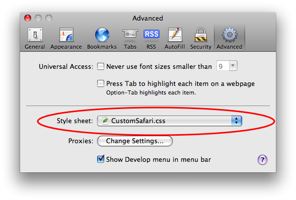
Copy the above code into a .css file, (“CustomSafari.css” is what I called mine) then select that file in Safari -> Preferences -> Advanced -> Style sheet:
safariStyleSheet.png

After restarting Safari, Twitter’s web interface should give you room to work.

May 15, 2009

Concise NSDictionary and NSArray Lookup

I started writing a list of ways I thought Objective-C could be improved, and I realized that many of my wishes involved more compact syntax. For example [array objectAtIndex:1] is so verbose I think it diminishes readability, compared to array[1].

I can’t quite match that brevity (can you, by using Objective-C++?), but with a one-line category, you can say, x = [array:1];.

@interface NSArray (ConciseLookup)
- (id):(NSUInteger)index;
@end
@implementation NSArray (ConciseLookup)
- (id):(NSUInteger)index;
{
	return [self objectAtIndex:index];
}
@end

My question is: do you find this compact “syntax” useful at all, or is it added complexity with no substantial code compression? Personally I think the latter, but the number of wishes I had involving more concise Objective-C syntax makes me wonder…

April 30, 2009

Acceptable Delays

This is a collection of sources on what constitutes an acceptable delay. It’s very much a work in progress, and will be updated when I stumble into new information. I’m very interested in any insights, experience, or sources you may have.

Based on some experiments I did back at IBM, delays of 1/10th of a second are roughly when people start to notice that an editor is slow. If you can respond is less than 1/10th of a second, people don’t perceive a troublesome delay.

Mark Chu-Carroll

One second … is the required response time for hypertext navigation. Users do not keep their attention on the page if downloading exceeds 10 seconds.

Jakob Nielsen, (in 1997?)

In A/B tests (at Amazon.com), we tried delaying the page in increments of 100 milliseconds and found that even very small delays would result in substantial and costly drops in revenue. (eg 20% drop in traffic when moving from 0.4 to 0.9 second load time for search results).

Greg Linden covering results disclosed by Google VP Marissa Mayer

If a user operates a control and nothing appears on the display for more than approximately 250 msec, she is likely to become uneasy, to try again, or to begin to wonder whether the system is failing.

— Jeff Raskin, The Humane Interface (page 75)

David Eagleman’s blog post Will you perceive the event that kills you? is an engaging look at how slow human perception is, compared to mechanical response time. For example, in a car crash that takes 70ms from impact until airbags begin deflating, the occupants are not aware of the collision until 150-300 milliseconds (possibly as long as 500 milliseconds) after impact.

April 21, 2009

A Scalpel Not a Swiss Army Knife

Filed under: Design,iPhone,Programming,Quotes,Usability | ,
― Vincent Gable on April 21, 2009

Steven Frank summarizing feedback on the direction future of computer interfaces,

The other common theme was a desire to see applications become less general purpose and more specific. A good example was finding out train or bus schedules. One way to do this is to start up your all-purpose web browser, and visit a transit web site that offers a downloadable PDF of the bus schedule pamphlet. Another way is to use an iPhone application that has been built-to-task to interface with a particular city’s transit system. It’s no contest which is the better experience.

…In 2009, it’s still a chore to find out from the internet what time the grocery store down the street closes — we’ve got some work to do.

I would like to see a nice pithy term replace “very specific task-driven apps”. Perhaps “Specialty Applications” or “Focused Programs”. But I’m not enamored with ether. Whatever the term, it should emphasize excelling at something, not being limited. What are your thoughts for a name?

« Newer PostsOlder Posts »

Powered by WordPress