Vincent Gable’s Blog

July 16, 2008

Determinism and Bending the Rules

Filed under: Quotes,Research | ,
― Vincent Gable on July 16, 2008

There is a very clever little experiment that you would be amused by, run by my colleague Jonathan Schooler. He has a bunch of students read a paragraph or two from the Francis Crick book, Astonishing Hypothesis, which is very deterministic in tone and intent. And then he has another group of students reading an inspirational book about how we make our own decisions and determine our own path. He then lets each group play a videogame in which you’re free to cheat. So guess who cheats? The people who have just read that it’s all determined cheat their pants off.

Tom Wolfe and Michael Gazzaniga discuss neuroscience, psychology, status, and free will over at Seed Magazine.

(Via Big Contrarian.)

June 28, 2008

Auto Dial

Filed under: Research,Usability | ,
― Vincent Gable on June 28, 2008

Today, most people I see making phone calls use cellphones. As near as I can tell, every time they call someone they know, they do it using their phone’s address book, instead of keying in their a ten-digit “telephone number”. It’s pretty obvious why. Nobody wants to have to memorize ten-digit numbers. And we think of people by their name, not some number.

This was not something that was hard to predict. Rolodexes have been in every office for decades, because people want to look up people by name, not number. Only recently has software supplanted them.

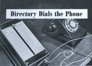
I was very surprised when I found this unknown invention from the late 1930’s

autodial.png
A NEW desk telephone directory not only finds the number you want but actually dials it for you. All you have to do is slide the knob on the face of the device, called an Auto Dial, to the name you want, then press the small lever at the foot of the machine. When the lever returns to its normal position, in five or six seconds, your call is made and you pick up the phone.

The Auto Dial was invented by a German before (World War II). The only sample in (America) is owned by Alfred Altman, President of the National Dairymen Association. The machine can handle any 50 telephone numbers desired by the user, and changes can be made at will.

The signals can be made up of any number of letters and digits, according to the system used in the local exchange. The regular hand dial on the telephone can be used in the ordinary way when the automatic device has been attached.

What an improvement over memorizing and/or dialing a number! We all have these devices built into our cellphones today. Frighteningly, the original appears easier to use then my cellphone’s “Address Book”.

So why didn’t this invention catch on half a century ago, not just a decade ago? I don’t know. I can only speculate, and I don’t think there is value in writing uninformed guesses down. But understanding why the Auto Dial was never popular is probably very instructive.

June 27, 2008

The Heat Barrier

Filed under: Research | , , , ,
― Vincent Gable on June 27, 2008

Technology improves at an overwhelming pace. The prospect of exponential growth has some people making fantastic predictions. Eg. “In 15 years, life expectancies will start rising faster than we age”.

I’m a big believer in the power of human invention. But I stumbled upon a somewhat sobering magazine article a few days ago.
CAN WE CRASH THE DEADLY FLAME BARRIER? (Oct, 1955)

Fly a plane fast enough and friction will melt it. Can we “put out the fire?”

As near as I can tell, the answer is no. Worse, maximum airspeed has declined over the years. For example, the absolute air-speed record of 2,194 MPH was set in 1976 with a currently retired aircraft. In 1976, we came up against the heat barrier, and could not break it. Since then, we have also retired the only two models of supersonic transport aircraft to see active service. The minimum time to cross the Atlantic is higher today then 20 years ago.

Now it’s safe to say that miles per gallon of fuel, and speed / gallon, have increased since 1976. This is almost certainly of more practical importance to the world. But I think it’s worth noting an example of a purely-technological dimension that has regressed with time. Not everything in technology doubles every two years.

May 26, 2008

People Prefer Sure (but small) Gains; Avoidable (but possibly large) Losses

Filed under: Quotes,Research,Usability | , ,
― Vincent Gable on May 26, 2008

Bruce Schneier has a new essay, How to Sell Security. As usual, it’s well worth reading.

The most interesting tidbit, to me, is that people have a bias to choose a small certain gain over an uncertain but possibly larger gain. But with loss, it’s the opposite. People avoid certain losses; preferring to “play double or nothing” — risking a larger loss for the chance of not sustaining a loss.

Here’s an experiment that illustrates Prospect Theory. Take a roomful of subjects and divide them into two groups. Ask one group to choose between these two alternatives: a sure gain of $500 and 50 percent chance of gaining $1,000. Ask the other group to choose between these two alternatives: a sure loss of $500 and a 50 percent chance of losing $1,000.

These two trade-offs are very similar, and traditional economics predicts that the whether you’re contemplating a gain or a loss doesn’t make a difference: People make trade-offs based on a straightforward calculation of the relative outcome. Some people prefer sure things and others prefer to take chances. Whether the outcome is a gain or a loss doesn’t affect the mathematics and therefore shouldn’t affect the results. This is traditional economics, and it’s called Utility Theory.

But Kahneman’s and Tversky’s experiments contradicted Utility Theory. When faced with a gain, about 85 percent of people chose the sure smaller gain over the risky larger gain. But when faced with a loss, about 70 percent chose the risky larger loss over the sure smaller loss.

This experiment, repeated again and again by many researchers, across ages, genders, cultures and even species, rocked economics, yielded the same result. Directly contradicting the traditional idea of “economic man,” Prospect Theory recognizes that people have subjective values for gains and losses. We have evolved a cognitive bias: a pair of heuristics. One, a sure gain is better than a chance at a greater gain, or “A bird in the hand is worth two in the bush.” And two, a sure loss is worse than a chance at a greater loss, or “Run away and live to fight another day.” Of course, these are not rigid rules. Only a fool would take a sure $100 over a 50 percent chance at $1,000,000. But all things being equal, we tend to be risk-adverse when it comes to gains and risk-seeking when it comes to losses.

This cognitive bias is so powerful that it can lead to logically inconsistent results. Google the “Asian Disease Experiment” for an almost surreal example. Describing the same policy choice in different ways–either as “200 lives saved out of 600” or “400 lives lost out of 600”– yields wildly different risk reactions.

Evolutionarily, the bias makes sense. It’s a better survival strategy to accept small gains rather than risk them for larger ones, and to risk larger losses rather than accept smaller losses. Lions, for example, chase young or wounded wildebeests because the investment needed to kill them is lower. Mature and healthy prey would probably be more nutritious, but there’s a risk of missing lunch entirely if it gets away. And a small meal will tide the lion over until another day. Getting through today is more important than the possibility of having food tomorrow. Similarly, it is better to risk a larger loss than to accept a smaller loss. Because animals tend to live on the razor’s edge between starvation and reproduction, any loss of food — whether small or large — can be equally bad. Because both can result in death, and the best option is to risk everything for the chance at no loss at all.

May 21, 2008

Programming Language Popularity

Filed under: Programming,Research
― Vincent Gable on May 21, 2008

TIOBE Programming Community Index

The TIOBE Programming Community index gives an indication of the popularity of programming languages. The index is updated once a month. The ratings are based on the number of skilled engineers world-wide, courses and third party vendors. The popular search engines Google, MSN, Yahoo!, and YouTube are used to calculate the ratings. Observe that the TIOBE index is not about the best programming language or the language in which most lines of code have been written.

If TIOBE is to be belived, then (as of May 2008), plain-jain C is the second-most popular language around, and Objective-C has an insignificant 0.083% share; less then Lisp, Haskell, and Smalltalk (the irony).

May 18, 2008

Intuitive Considered Harmful

Filed under: Accessibility,Design,Programming,Quotes,Research,Usability | ,
― Vincent Gable on May 18, 2008

intuition
noun
the ability to understand something immediately, without the need for conscious reasoning.

“Intuitive” sounds like a great property for an interface to have, but in The Humane Interface (pages 150-152), Jeff Raskin calls it a harmful distraction:

Many interface requirements specify that the resulting product be intuitive, or natural. However, there is no human faculty of intuition…When an expert uses what we commonly call his intuition to make a judgment … we find that he has based his judgment on his experience and knowledge. Often, experts have learned to use methods and techniques that non-experts do not know… Expertise, unlike intuition, is real.

When users say that in interface is intuitive, they mean that it operates just like some other software or method with which they are familiar.

Another word that I try to avoid in discussing interfaces is ‘natural’. Like ‘intuitive’, it is usually not defined. An interface feature is natural, in common parlance, if it operates in such a way that a human needs no instruction. This typically means that there is some common human activity that is similar to the way the feature works. However, it is difficult to pin down what is meant by ‘similar’. … the term ‘natural’ (can also equate) to ‘very easily learned’. Although it may be impossible to quantify naturalness, it is not to difficult to quantify learning time.

The belief that interfaces can be intuitive and natural is often detrimental to improved interface design. As a consultant, I am frequently asked to design a “better” interface to a product. Usually, an interface can be designed such that, in terms of learning time, eventual speed of operation (productivity), decreased error rates, and ease of implementation, it is superior to both the client’s existing products and competing products. Nonetheless, even when my proposals are seen as significant improvements, they are often rejected on the grounds that they are not intuitive. It is a classic Catch-22: The client wants something that is sigificantly superior to the competition. But if it is to be superior, it must be different. (Typically, the greater the improvement, the greater the difference.) Therefore, it cannot be intuitive, that is, familiar. What the client wants is an interface with at most marginal differences from current practice — which almost inevitably is Microsoft Windows — that, somehow, makes a major improvement.

There are situations where familiarity is the most important concern, but they are rare. One example is a kiosk at a tourist attraction. Millions of people will use it only once, and they must be able to use it as soon as they touch it (because they will walk away rather then spend their vacation reading a manual). And in such cases, mimicking the most promiscuously used interface you can find, warts and all, makes sense — if that means more people will already know how to use it.

Outside of rare exceptions, software that people use enough to justify buying is used repeatedly. The value of the product is what people make with it, not what they can do with it the moment they open the box. Designing for the illusion of “intuitiveness” is clearly the wrong choice when it harms the long-term usefulness of the product.

This is not an excuse for a crappy first-run experience! The first impression is still the most important impression. By definition, the less familiar something is, the more exceptional it is. And an exceptionally good first impression is what you are after — so unfamiliarity can work to your advantage here. It is more work to design an exceptional first-run experience, but good design is always more work.

This is not a rational for being different just to be different. It is a rational for being different, when different is measurably better. For something to be measurably better, it first needs to be measurable. That means using precise terms, like “familiar” instead of “intuitive”, and “quick to learn” not “natural”.
May 9, 2008

The Back Button is Now #3

Filed under: Accessibility,Design,Quotes,Research,Usability
― Vincent Gable on May 9, 2008

Among other things, (this study) found that the Back button is now only the 3rd most-used feature on the Web. Clicking hypertext links remains the most-used feature, but clicking buttons (on the page) has now overtaken Back to become the second-most used feature. The reason for this change is the increased prevalence of applications and feature-rich Web pages that require users to click page buttons to access their functionality.

Jakob Nielsen’s Alertbox, May 6, 2008:

April 28, 2008

Wikipedia vs Television

Filed under: Quotes,Research | , , , ,
― Vincent Gable on April 28, 2008

So if you take Wikipedia as a kind of unit, all of Wikipedia, the whole project–every page, every edit, every talk page, every line of code, in every language that Wikipedia exists in–that represents something like the cumulation of 100 million hours of human thought. I worked this out with Martin Wattenberg at IBM; it’s a back-of-the-envelope calculation, but it’s the right order of magnitude, about 100 million hours of thought.

And television watching? Two hundred billion hours, in the U.S. alone, every year. Put another way, now that we have a unit, that’s 2,000 Wikipedia projects a year spent watching television. Or put still another way, in the U.S., we spend 100 million hours every weekend, just watching the ads.

From one of more inspiring talks I’ve read in a long time.

April 25, 2008

Larger Displays are Better. More Displays are Better.

Filed under: Accessibility,Design,Research,Tips,Usability
― Vincent Gable on April 25, 2008

Here’s Jakob Nielsen’s economic justification for giving employees large screens,

Big monitors are the easiest way to increase white-collar productivity, and anyone who makes at least $50,000 per year ought to have at least 1600×1200 screen resolution. A flat-panel display with this resolution currently costs less than $500. So, as long as the bigger display increases productivity by at least 0.5%, you’ll recover the investment in less than a year. (The typical corporate overhead doubles the company’s per-employee cost; always remember to use loaded cost, not take-home salary, in any productivity calculation.)

Jeff Atwood has written a “one-stop-shop for research data supporting the idea that, yes, having more display space would in fact make you more productive”. But he warns us that “Having all that space can make you less productive due to all the window manipulation excise you have to deal with to make effective use of it.”He calls this the Large Display Paradox. But, there are solutions to this problem. Using software to divide the large single-display into a “grid” of virtual “monitors” is the one he proposes.

A recent and widely publicized University of Utah study concluded that people were less productive on a 26″ screen then an 18″ screen. (Unfortunately I haven’t found a better link to their actual data then this crappy PDF brochure.) However, they also found that people were more productive with two 20″ screens. Their 26″ monitor was 1920×1200 pixels = 2.3 MP, their 20″ was 1600×1200 pixels = 1.92MP, so two 20″ screens = 3.84 MP, quite a bit bigger then the 26″ screen, and with greater productivity. This supports the theory with the right windowing system, productivity increases as the number of usable pixels increases.

I’ve only found one exception to the “bigger is better” rule of workspaces. Portability (Availability) can be worth more then pure productivity. There’s an old gunslinger saying that “The best gun in the world is the the one I’ve got in my hand right now”. Similarly, having a “big iron” on your office isn’t much use if you are flying somewhere over the atlantic. There’s no substitute for having a computer in-hand. Even if you would be more productive using a 17″ laptop, it’s better to get a 13″ ultra-portable, if it means you are more likely to actually have it around when you need it.

Business travelers, and creative professionals who work better in eclectic settings, are examples of people who are better served by the smallest sufficiently-powerful laptop they can find. But for most people bigger is better. Fortunately, small laptops can be connected to large displays.

April 7, 2008

foreach For The Win

Filed under: C++,Cocoa,Design,Objective-C,Programming,Research
― Vincent Gable on April 7, 2008

I love foreach. What I really mean is that I really like dead-simple ways to iterate over the items in a container, one at a time. It goes beyond syntactic sugar; making errors harder to write, and easier to spot.

I’m using the term “foreach”, because the first time I realized the utility of simple iteration was seeing Michael Tsai’s foreach macro. I instantly fell in love with the ‘keyword’, because it greatly simplifies iterating over items in a Cocoa container. My reaction was so strong, because the (then current) Cocoa iteration idiom I was using was so bad. As Jonathan ‘Wolf’ Rentzsch says:

I have a number of issues with enumeration in Cocoa/ObjC. Indeed, I have a problem with every one of the three lines necessary in the standard idiom. It even goes beyond that — I have an problem with the very fact it’s three lines of code versus one.

Objective-C 2.0 (Leopard and later) introduced Fast Enumeration. It’s a better way of handling enumeration then Michael Tsai’s macro, but if you are stuck using Objective-C 1.0, then I highly recommend using his foreach macro.

I do not like the C++ stl for_each idiom. It’s not simple enough.

To explain what’s wrong with for_each I should explain what a “foreach” should look like. It should be a two-argument construct: “foreach (item, container)“, and no more. container should be evaluated only once. Syntax details aren’t terribly important, as long as they make sense.
foreach(child, naughtyList)
iterate(child, naughtyList)
ForEach(String child, naughtyList)
for child in naughyList:
for(NSString *child in naughtyList)
Are all fine constructs.

The most obvious benefits of a foreach is that it’s less code, easier to write, and less work to read. Implemented correctly, it also makes bugs harder to write — mostly because it minimizes side effects in the loop construct. For example, do you see the bug in the following code?

for( list<shared_ptr<const Media> >::iterator it = selectedMedias->selectedMediaList().begin(); it != selectedMedias->selectedMediaList().end(); ++it )

I didn’t; and it’s kind of a trick question. ->selectedMediaList() isn’t an accessor function — it constructs a new list every time it is called. So selectedMediaList() != selectedMediaList() because it returns a different list each time. The loop never terminates because it will never equal end(), since it is the end of a different list. But you have no way of knowing this without knowing details of what selectedMediaList() does.

Using BOOST_FOREACH avoids the problem:
BOOST_FOREACH(shared_ptr<const CSMediaLib::Media> media, selectedMedias->selectedMediaList())
works regardless of how selectedMediaList() is implemented, because it is only evaluated once. It’s also easier to write, and to read. I haven’t used BOOST_FOREACH much, but it’s been totally positive so far. (Yes, the name is ugly, but that’s not important).

Loops are a staple of programming. Simplifying and error-proofing the most common kind of loop is a huge productivity win. foreach regardless of it’s flavor, is worth a try.

« Newer PostsOlder Posts »

Powered by WordPress