Vincent Gable’s Blog

July 14, 2009

Dozen Page Impression: Design your Life

Filed under: Accessibility,Announcement,Design,Usability | , , , ,
― Vincent Gable on July 14, 2009

I had some time to kill today, waiting for a catalytic converter replacement, and the book Design Your Life: The Pleasures and Perils of Everyday Things caught my eye. It’s loosely about about the value of design and how to apply UX to everyday life. I’ve only read1 a dozen or so pages of it in a bookstore, but so far I definitely recommend the book.

Visually it’s is appealing (but of course it has to be!), and accessibly written.

But what really impressed me the most, is that it gives you a critical eye and a reason to ask ‘why?’. And I think that’s the most important thing you can get out of a book on UX/design/accessibility.

The authors also have have a website which looks to be every bit as good as the book.


1You’re probably wondering why I didn’t buy the book if I like it enough to recommend it. Well, I had my iPhone with me in the store, and I looked up the price on amazon. It was half what the brick-and-mortar store was asking. So I didn’t buy it. Speaking of which, if you order the book through any of the links on this page, I get a small commission from Amazon. So please do doubt my recommendation — that’s what critical thinking is all about!

July 10, 2009

Build Dumb Interfaces to Smart Brains

Filed under: Accessibility,Design,Quotes,Usability | , , ,
― Vincent Gable on July 10, 2009

control interfaces must not be intelligent. Briefly, intelligent user interfaces should be limited to applications in which the user does not expect to control the behavior of the product. If the product is used as a tool, its interface should be as unintelligent as possible. Stupid is predictable; predictable is learnable; learnable is usable.

Mencius Molbug

Jeff Raskin calls this principle it monotony, and explains it comprehensively in The Humane Interface.

I’ve always felt a little uneasy about the idea. Computers are supposed to free us from tedium and repetition, by doing things for us. A fluid interface is unnatural yes, but the goal of computing should be to exceed what’s possible in the corporal word, not to copy it imperfectly.

But fundamentally, I think Raskin and Molbug are more right than wrong. Paradoxically, dumb interfaces beat smart interfaces most of the time.

July 3, 2009

Thank you sir, may I have another?

Filed under: Design,Quotes,Usability | , , ,
― Vincent Gable on July 3, 2009

Apparently by 1958, mankind’s subservient relationship with computers was sadly well established,

AT THE Vanguard Computing Center – in Washington, D. C, I watched a young woman present a machine with an extremely complex problem in ballistics involving hundreds of variables. At once lights on a control panel twinkled and winked as the computer checked to see that all equipment was operating properly. Then it set briskly to work. Magnetic tapes spun in their shiny glass-and-steel vacuum cabinets, the high-speed printer muttered. Suddenly the machine stopped and the electric typewriter wrote: “Last entry improperly stated!”

A little embarrassed, the young operator corrected her error, and the machine started again. Four minutes later it gave an answer that had required several million individual calculations.

“This is a wonderful machine” the girl said, “but it makes you shiver sometimes, especially when you give it a wrong figure. Once in a while we give it an incorrect figure on purpose—just to see it sneer at us.

THINKING MACHINES ARE GETTING SMARTER (Oct, 1958)

I’d never discourage anyone from making the most fun error messages and interactions possible. But when being sneered at by the machine gives operators more of a connection to it than using it normally, I think something is broken. I can’t imagine that fostering a healthy operator-machine relationship. Honestly though, I don’t know that it’s worse than the same boring regular interactions, but with boring error messages instead.

July 2, 2009

Design for Mental Imperfections

When it comes to building the physical world, we kind of understand our limitations. We build steps. … We understand our limitations. And we build around it. But for some reason when it comes to the mental world, when we design things like healthcare and retirement and stockmarkets, we somehow forget the idea that we are limited. I think that if we understood our cognitive limitations in the same way that we understand our physical limitations, even though they don’t stare us in the face in the same way, we could design a better world. And that, I think, is the hope of this thing.

Dan Ariely, concluding a very entertaining TED talk. The transcript is up, but I liked his delivery so much I watched the video.

Stairs and ladders aren’t an implication that you’re too weak to pull yourself out of a pool. Yet amazingly people sometimes get insulted by simplified interfaces, as if it somehow implies they are so stupid they can’t handle complexity.

I was fortunate enough to hear Jonathan Ive talk about launching the iMac. As he was leaving a store on launch-day, a furious technology reported accosted him in the parking lot, shouting What have you done? He was incensed that the iMac was so cute, approachable, and untechnical — everything that he thought a computer shouldn’t be.

Some of this behavior is explained by simple elitism. If computers are hard to use, than it keeps the idiots out, and proves what a macho man you are if you can use them.

But I suspect refusal to accept our cognitive limitations is also related to our cultural refusal to accept mental illness. Quoting Mark C. Chu-Carroll’s experience with depression,

How many people have heard about my stomach problems? A lot of people. I need to take the drugs three times a day, so people see me popping pills. … Out of the dozens of people who’ve heard about my stomach problem, and know about the drugs I take for it, how many have lectured me about how I shouldn’t take those nasty drugs? Zero. No one has ever even made a comment about how I shouldn’t be taking medications for something that’s just uncomfortable. Even knowing that some of the stuff I take for it is addictive, no one, not one single person has ever told me that I didn’t need my medication. No one would even consider it.

But depression? It’s a very different story.…

Somewhat over 1/2 of the people who hear that I take an antidepressant express disapproval in some way. Around 1/3 make snide comments about “happy pills” and lecture me about how only weak-willed nebbishes who can’t deal with reality need psychiatric medication.

I confess to being thoroughly mystified by this. Why is it OK for my stomach, or my heart, or my pancreas to be ill in a way that needs to be treated with medication, but it’s not OK for my brain? Why are illnesses that originate in this one organ so different from all others, so that so many people believe that nothing can possibly go wrong with it? That there are absolutely no problems with the brain that can possibly be treated by medication?

Why is it OK for me to take expensive, addictive drugs for a painful but non-life-threatening problem with my stomach; but totally unacceptable for me to take cheap harmless drugs for a painful but non-threatening problem with my brain?

If we can accept that our brains are fallible, like everything else, and that this isn’t somehow immoral, we can build a better world.

June 22, 2009

(Hyper)Text is King of Substance

Filed under: Accessibility,Design,Quotes,Usability | , , , , ,
― Vincent Gable on June 22, 2009

…I’d rather have the text of Clay’s speech than the video. For things that matter, written words are unambiguously better than speech. To start with, anything that matters isn’t just written, it’s usually rewritten repeatedly (and more important, condensed). Plus, it has hyperlinks. Plus, it’s smaller and cheaper to ship around. Plus, it’s searchable. Plus, it works on more devices. (I acknowledge that only the first of these is fundamental; but that alone would be enough).

Tim Bray

Videos, speech, etc. will always carry more emotional content. But for consuming ideas, text offers the highest bandwidth and most precision. Unfortunately, writing well takes time, and can hinder conversation.

Conceptually, I believe illustrative pictures and infographics are valid elements of modern text, like links, or typography.

June 19, 2009

All’s Well That Ends Well

Filed under: Design,Quotes,Usability | , , , ,
― Vincent Gable on June 19, 2009

the peak end rule. When thinking about a total experience, people tend to place too much weight on the last part of the experience. In one experiment, people had to hold their hands under cold water for one minute. Then, they had to hold their hands under cold water for one minute again, then keep their hands in the water for an additional 30 seconds while the temperature was gradually raised. When asked about it afterwards, most people preferred the second option to the first, even though the second had more total discomfort. (An intrusive medical device was redesigned along these lines, resulting in a longer period of discomfort but a relatively comfortable final few seconds. People liked it a lot better.)

Bruce Schneier

May 31, 2009

The Best Quicksort Ever

Filed under: Design,Programming,Sample Code | , , , ,
― Vincent Gable on May 31, 2009

The first time I saw this quicksort in Haskell was an eye opening moment,

 
qsort []     = []
qsort (x:xs) = qsort (filter (< x) xs) ++ [x] ++ qsort (filter (>= x) xs)

The first line reads: “When you sort an empty list ([]), the result is another empty list”. The second line reads: “To sort a list whose first element is named x and the rest of which is named xs, sort the elements of xs that are less than x, sort the elements of xs that are greater than or equal to x, and concatenate (++) the results, with x sandwiched in the middle.”

The code is so concise, yet clear (even with cryptic variable names like xs). The day my professor wrote it on the whiteboard was the first time I internalized that there might be something good about the alien world of functional programming.

The biggest revelation to me was, filter (< x) xs . It’s amazing that (< x) builds a temporary, unnamed, function equivalent to C++,

bool lessThanX(AnyOrderedType y){
    return y < X;
}
//plus the definition of X somewhere...

Building a function! It’s still profound stuff to me. And clearly it really uses fewer lines of code. Amazingly, using list comprehension syntax is not more concise,

qsort (x:xs) = qsort [i | i <- xs, i < x] ++ [x] ++ qsort [i | i <- xs, i <= x]

compared to the original,

qsort (x:xs) = qsort (filter (< x) xs) ++ [x] ++ qsort (filter (>= x) xs)

I hope this is an ah-ah moment for someone else too. I’d love to know what made you interested in functional programming; or if you know of a more elegant quicksort implementation.

May 26, 2009

Secret Questions Are a Bad Idea

Filed under: Design,Quotes,Security,Usability | , , ,
― Vincent Gable on May 26, 2009

Secret questions are an easier way for someone to hack your account. I don’t see that they offer much over asking people to pick an insecurely convenient password.

Here’s some data on how insecure secret questions are,

Acquaintance with whom participants reported being unwilling to share their webmail passwords were able to guess 17% of their answers (to “secret” questions). Participants forgot 20% of their own answers within six months. What’s more, 13% of answers could be guessed within five attempts by guessing the most popular answers of other participants, though this weakness is partially attributable to the geographic homogeneity of our participant pool.


It’s no secret: Measuring the security and reliability of authentication via ‘secret’ questions
, Stuart Schechter, A. J. Bernheim Brush, Serge Egelman, 17 May 2009

(Via Bruce Schneier)

It’s important to note that people often forget answers to their own secret questions. Anecdotally, I’ve had to call my bank twice because I forgot exactly how I typed in my answers.

Forgetting the answer to a secret question can be embarrassing, unlike forgetting a password. I once got my mother’s maiden name wrong repeatedly. It was pretty awkward. (A credit card was also in my mother’s name, so when they asked “for my mother’s maiden name” they really meant her mother’s maiden name.)

I don’t know of any statistics on how often accounts are compromised by secret questions. But there have been high-profile cases, like Sarah Palin’s email,

…the Palin hack didn’t require any real skill. Instead, the hacker simply reset Palin’s password using her birthdate, ZIP code and information about where she met her spouse — the security question on her Yahoo account, which was answered (Wasilla High) by a simple Google search.

Bruce Schneier says, “Passwords have reached the end of their useful life. Today, they only work for low-security applications. The secret question is just one manifestation of that fact.” If you must use password authentication, then don’t weaken it further with a questionable back door.

May 19, 2009

Improving Twitter.com: Space to Work

Filed under: Design,Sample Code,Tips,Usability | , , , , ,
― Vincent Gable on May 19, 2009

The Change

Enlarge the “What are you doing” box on Twitter.com, to make compressing substantial ideas easier.

Twitter.com with a larger text-field

Motivation

I’ve been disappointed with the posting interface of every Twitter-client I’ve tried so far. Just like any writing, tweets start with a first draft. My first drafts are often longer than 140 characters. That shouldn’t be a problem; trimming the fat is part of any editing process. But most Twitter-interfaces are so downright hostile to anything longer then 140 characters that trimming a 145 letter utterance is a frustrating study in fighting my tools.

(The worst client I tried was, Blogo, which would stop you from typing and yell at you with a dialog if you dared press another key after typing 140 characters. But Twitterrific was little better; I don’t understand how something so user-unfriendly became so popular.)

Even Twitter.com doesn’t give you enough room for writing a long, but under-the-limit tweet. To see for yourself, just start typing “mmmmm”; the box will run out of room before you run out of characters. It’s downright crazy to have to scroll to see all of a tweet you are writing.

Now there’s nothing wrong with trying to prescribe a pithy style of communication. Clearly Twitter wouldn’t have worked otherwise. But punishing users for doing the “wrong” thing isn’t as effective as giving them the tools to change their behavior, to wit: space to work on shortening their writing.

The Code

This CSS code makes the direct-messaging, and “what are you doing?” text-boxes tall enough to hold 5 lines of text without scrolling. By default Twitter’s web interface only holds 2 lines of text on screen.

#dm_update_box #direct_message_form fieldset div.info textarea#text,
#status_update_box #status_update_form fieldset div.info textarea#status {
	height: 6em !important;
}

The selectors I used are pretty specific to Twitter.com, so it’s unlikely this will interfere with another site’s layout, unless it’s HTML code is nearly identical to Twitter’s.

How-To: Safari

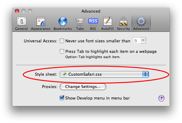
Copy the above code into a .css file, (“CustomSafari.css” is what I called mine) then select that file in Safari -> Preferences -> Advanced -> Style sheet:
safariStyleSheet.png

After restarting Safari, Twitter’s web interface should give you room to work.

April 30, 2009

Acceptable Delays

This is a collection of sources on what constitutes an acceptable delay. It’s very much a work in progress, and will be updated when I stumble into new information. I’m very interested in any insights, experience, or sources you may have.

Based on some experiments I did back at IBM, delays of 1/10th of a second are roughly when people start to notice that an editor is slow. If you can respond is less than 1/10th of a second, people don’t perceive a troublesome delay.

Mark Chu-Carroll

One second … is the required response time for hypertext navigation. Users do not keep their attention on the page if downloading exceeds 10 seconds.

Jakob Nielsen, (in 1997?)

In A/B tests (at Amazon.com), we tried delaying the page in increments of 100 milliseconds and found that even very small delays would result in substantial and costly drops in revenue. (eg 20% drop in traffic when moving from 0.4 to 0.9 second load time for search results).

Greg Linden covering results disclosed by Google VP Marissa Mayer

If a user operates a control and nothing appears on the display for more than approximately 250 msec, she is likely to become uneasy, to try again, or to begin to wonder whether the system is failing.

— Jeff Raskin, The Humane Interface (page 75)

David Eagleman’s blog post Will you perceive the event that kills you? is an engaging look at how slow human perception is, compared to mechanical response time. For example, in a car crash that takes 70ms from impact until airbags begin deflating, the occupants are not aware of the collision until 150-300 milliseconds (possibly as long as 500 milliseconds) after impact.

« Newer PostsOlder Posts »

Powered by WordPress