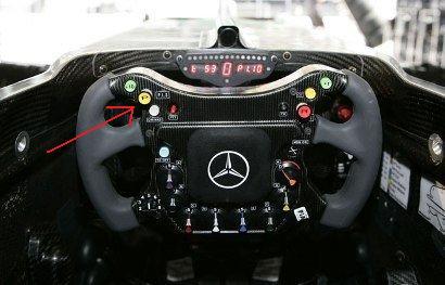
Given that all 11 F1 teams have converged on a remarkably similar UI (for a dashboard on a steering wheel), independently, you would think that (the style) was a rational design, however its complexity possibly caused Lewis Hamilton the 2007 F1 championship, when he accidentally pressed the neutral button …
What is clear is that there is no clear accentuation of features (color, size) by how often the are used, merely by position. Even if drivers like Hamilton are experts and fully familiar with the UI, there is a tiny percentage chance of error. Our guess is that this trend in car UI would be a mistake if it filters through to everyday cars, and that F1 cars will revert to a more simple UI over time.
— oobject.com (article includes a gallery of F1 steering wheels)
Certainly I have made mistakes with traditionally mounted dashboards in every car I have owned. But the mistakes haven’t significantly impaired by driving. Accidentally turning on the air conditioner or radio aren’t a big deal — even with my old Volvo that couldn’t accelerate as well with the AC on.
