Vincent Gable’s Blog

September 17, 2009

Installing Mac Apps

Filed under: Accessibility,MacOSX,Programming,Usability | , , ,
― Vincent Gable on September 17, 2009

Today’s Daringfireball article on the shortcomings of the Mac application-install procedure is worth a skim. Gruber’s suggestion that Mac OS X automatically move 3rd-party applications into the /Applications/ folder on first-run, (a la the dashboard widget install process) is a good one1. Since Mac OS X already prompts you on first run (“Are you sure you want to run a program Apple didn’t write?”) it’s hard to see any downsides to this idea.

But that’s not the behavior we have today1.

Don’t Use a Damn .dmg!

As it stands today, I don’t see a good reason to ship your apps as a .dmg. I’ve been suspicious of disk images for a few years now; and usability tests show that people get confused by them.

Distribute your application as a single .app in a .zip archive. What possible use are other files besides the application? If a “Readme” file should be read before using the application, then show it when the application is first launched.

Installers are opaque and un-Mac like. There’s always a risk that they’ll install something that breaks the computer. As a developer I am even more suspicious of installers on the Mac, because I know how broken Apple’s installer tools are.

Of course, as a developer, I know that applications do sometimes need to install components. And here the best solution is for the application to check it’s environment and ask to install missing components as needed (in essence be it’s own installer). It’s more robust, since it detects-and-corrects missing or damaged components. It always preserves the user-facing abstraction that the icon is the application.

Applications shouldn’t install hacks dangerous enough to require a bundled user-facing unisntaller. To make IMLocation work, I had to install a background process — but I made it intelligent enough that it would uninstall itself if the main application had been deleted. Yes, this is more work, but it’s worth it.


1Another idea is to make Safari and Firefox smart enough to download applications directly into the right /Applications/ folder, bypassing the usual downloads folder. This elegantly solves the instillation problem, although it creates some new problems.

2Although it would be a cool hack to write.
May 19, 2009

Improving Twitter.com: Space to Work

Filed under: Design,Sample Code,Tips,Usability | , , , , ,
― Vincent Gable on May 19, 2009

The Change

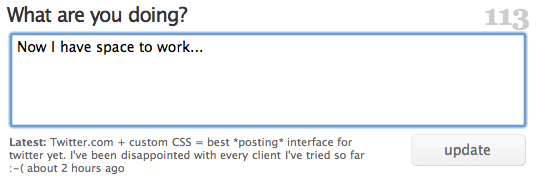
Enlarge the “What are you doing” box on Twitter.com, to make compressing substantial ideas easier.

Twitter.com with a larger text-field

Motivation

I’ve been disappointed with the posting interface of every Twitter-client I’ve tried so far. Just like any writing, tweets start with a first draft. My first drafts are often longer than 140 characters. That shouldn’t be a problem; trimming the fat is part of any editing process. But most Twitter-interfaces are so downright hostile to anything longer then 140 characters that trimming a 145 letter utterance is a frustrating study in fighting my tools.

(The worst client I tried was, Blogo, which would stop you from typing and yell at you with a dialog if you dared press another key after typing 140 characters. But Twitterrific was little better; I don’t understand how something so user-unfriendly became so popular.)

Even Twitter.com doesn’t give you enough room for writing a long, but under-the-limit tweet. To see for yourself, just start typing “mmmmm”; the box will run out of room before you run out of characters. It’s downright crazy to have to scroll to see all of a tweet you are writing.

Now there’s nothing wrong with trying to prescribe a pithy style of communication. Clearly Twitter wouldn’t have worked otherwise. But punishing users for doing the “wrong” thing isn’t as effective as giving them the tools to change their behavior, to wit: space to work on shortening their writing.

The Code

This CSS code makes the direct-messaging, and “what are you doing?” text-boxes tall enough to hold 5 lines of text without scrolling. By default Twitter’s web interface only holds 2 lines of text on screen.

#dm_update_box #direct_message_form fieldset div.info textarea#text,
#status_update_box #status_update_form fieldset div.info textarea#status {
	height: 6em !important;
}

The selectors I used are pretty specific to Twitter.com, so it’s unlikely this will interfere with another site’s layout, unless it’s HTML code is nearly identical to Twitter’s.

How-To: Safari

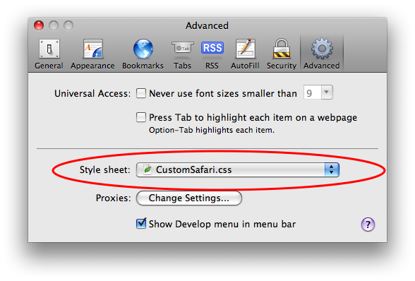
Copy the above code into a .css file, (“CustomSafari.css” is what I called mine) then select that file in Safari -> Preferences -> Advanced -> Style sheet:
safariStyleSheet.png

After restarting Safari, Twitter’s web interface should give you room to work.

June 20, 2008

Modern Browsers

Filed under: MacOSX,Programming,Quotes | , , , ,
― Vincent Gable on June 20, 2008

… What struck me watching these (WebKit) demos is that you could build a really slick web app UI using stuff like the canvas tag, SVG, and advanced CSS. Yes, none of this stuff works in IE, and IE still has massive market share — but not among the sort of people who adopt hip new web apps. The combined market share for, say, Firefox 3 and Safari 3 is larger than the overall market share for Mac OS X. Plenty of developers write desktop software that only works on the Mac — why aren’t more people writing apps web apps that only work in truly modern web browsers? The first one to do it is going to be a sensation.

John Grubber

I didn’t have a sense for how far behind IE lags, historically and today, until I saw this compatibility table (via Toby Jungen),

Calculation of support of currently displayed feature lists

Internet Explorer Firefox Safari Chrome Opera
Far Past 6.0: 4% 2.0: 34% 3.1: 43% 0.2: 54% 9.0: 35%
Past 7.0: 12% 2.0: 34% 3.1: 43% 0.2: 54% 9.0: 35%
Present 8.0: 29% 3.0: 48% 3.2: 67% 1.0: 54% 9.6: 58%
Near Future (2009) 8.0: 29% 3.5: 78% 4.0: 88% 2.0: 84% 10.0: 63%
Future (2010 or later) 9.0: 29% 4.0: 86% 4.*: 88% 2.0: 84% 10.*: 72%

Powered by WordPress